Providing a robust, designed user experience is hard. It’s an iterative process requiring lots of tweaking and detailing, testing and retesting to continually improve.
And while not every company has the time/resources to pour into it, these five guidelines can help improve virtually any website.
1. Get rid of drop-down menus
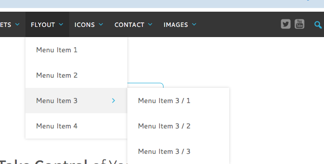
Holding a mouse over menus that keep disappearing is a surefire way to drive your users crazy.
Just stop doing it.
What’s more, the Nielsen Norman Group recommends using them sparingly because “Drop-down menus are often more trouble than they are worth.”
Here’s why:
- They hide information and make discovering your site harder.
- They take up too much screen space when expanded.
- There are other alternatives that work better (e.g. endless scroll on mobile).
- Hovering over menu after menu only to lose the whole structure at the end is outrageously frustrating.
Of course, these can’t always be avoided. In some cases, large websites are are simply too complex for drop-down menus to be avoided, and can even warrant a ‘mega menu’.
But if you can, make your users happy, and use drop down only sparingly.
2. Refine your design
 Image source: Luum Textiles
Almost every single website has one or two design elements that don’t add much, but the designer/developer/approval committee/stakeholders absolutely loved. A big part of making a great site is paring back elements that don’t add much at all, so the ones that do can really shine.
A good rule of thumb is that if you can’t explain why something is on a page, then it shouldn’t be included on that page.
For example, imagine you’re designing a features page, and you want an icon at the top because it looks nice.
While it might look nice, that’s not a specific function (unless, of course, your target audience doesn’t know what features are but understands intricate iconography. Then, by all means.)
Which means it should be cut.
This sort of ruthless element assassination keeps your site lean, fast, and easy to understand – no fluff, no nonsense.
3. Hone your copy to add value

If you really want to get your users to love your website, you need to refine what you say so they’re getting the most bang for their time.
Remember: your users are people. And as a rule, people don’t have a lot of spare time. They’re busy with all sorts of other things. That’s why if you look at a graph of load time vs visitor retention, there’s a huge drop off after three seconds – people will move on to something else.
Which means your copy needs to convey exactly why they should give you the time of day, right at the very start.
Take, for example, the headline for Trello, a project management tool:
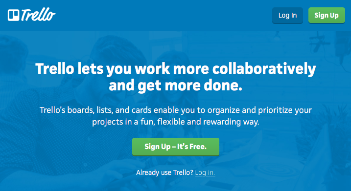
Trello lets you work more collaboratively and get more done.
Instantly, they tell the user:
- What they do
- How they do it
- What the benefit is
All your website copy should aim to be as focused, concise, and as user-orientated as Trello’s headline.
4. Give content away for free
The value of a blog is well documented. But that’s not the only content stream you have available to you to reach your users and give them what they what.
Value-add or protected content, where you get your users to give up something (usually contact information) to access it, is usually seen as a marketing trick.
And one that users tolerate, but don’t love.
The key to getting your users to love your site is to create content (even protected content) that’s so useful they’re lining up to get it.
For example, if you produce an amazing, long, and detailed guide to solving a precise and technical problem, your users will be so grateful they’ll love your site forever, regardless of the fact they’re on your email list now.
5. Make your processes easy
Finally, the best possible thing you can do for your users is make your processes easy.
It’s as simple as that.
Whether it’s an onboarding process, an inbound sales process, or finding contact information so they can give you a call, make it easy for your users.
That’s what unites incredible user experiences and sets them apart from mediocre ones: they’re easy.
For example, if you have some value-add content, focus on what you’re asking for in exchange. How much value does it really add to ask who people work for? If it doesn’t offer much for your purposes, that’s a field you can get rid of.
This sort of micro-optimization will make your overall site easier to use, and thus, your users happier overall.
Conclusion
You don’t have to be Apple, or have a team of UX/UI designers on staff, to make your users love your site.
Just be refining, streamlining, and optimizing and testing over time, you can build a website that is simple, elegant, and great at what it does.
If you do that, your users are sure to love it. Guaranteed.
Have you got a thorny website that your users just can’t seem to get behind? Get in touch! We might be able to help.
