Let’s start by stating the obvious: mobile is different from desktop, and designing with mobile top-of-mind is becoming increasingly important. Users are turning to their mobile devices more and more these days, and that means website designs need to adapt – in ways that go beyond a smaller screen size.
With mobile becoming an increasingly popular way to connect, the way users interact with online content is shifting. In this post, we’ll look at some of the ways user interactions on mobile differ from interactions on desktop – and how you can use those differences to design a better mobile experience.
1) Tapable vs. Clickable Interactions

Most mobile devices today use a touchscreen, which fundamentally changes the way users interact with them: instead of using a cursor to click, users tap their screen and gesture to interact with interface elements.
This might not sound like a huge deal, but it’s actually one of the main things that needs to be accommodated for in mobile design, and it crops up all over the place. Think of how you click a text link. It’s easy enough to click an embedded link with a mouse, but with finger taps it’s a different story – this is sometimes referred to as the “fat finger problem.”
The fat finger problem is easy to solve once you’re aware of it. It’s just a matter of enlarging interface elements – things like call-to-action buttons, links, and navigation labels – and ensuring that there’s adequate space between them.
2) Dropdown Menus
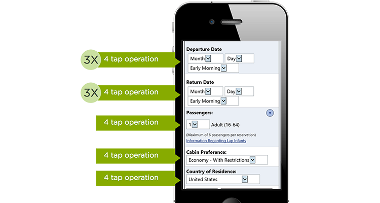
Speaking of taps, one way of thinking about the quality of mobile design is to consider how many taps it takes a user to complete a given task (less taps = more usability). Which brings us to dropdown menus, the mobile “UI of last resort.”
 via lukew.com
Dropdown menus work fine on desktop, where the number of taps and amount of user interaction isn’t such a big deal. On mobile, however, dropdowns become a big problem for users, and they’re often used where more appropriate, more user-friendly, or simpler controls would work better.
Let’s say you’re filling out a form on your phone. If that form used dropdown menus for every question, it would be a nightmare to fill out – dropdowns require multiple taps, more involved interaction, and they generally take longer.
On the flipside, a form that uses a variety of context-appropriate input controls for different kinds of information would be significantly more usable. Date range pickers (the kind you often see on flight or hotel booking websites) are a good example of this. Instead of using a complicated dropdown menu to choose dates – which would require lots of tapping and scrolling – date range pickers let users select their dates with a few taps. It’s less time consuming, more context-appropriate, and it works particularly well on mobile.
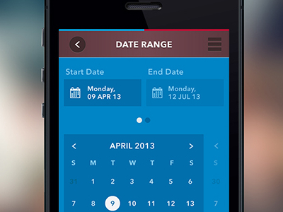 Date picker concept, via Dribbble
The proof is in the numbers. This test found that avoiding dropdown menus on mobile made users 60% faster, and dramatically reduced user errors. It also found that using a stepper, as opposed to a dropdown menu, resulted in an 11% higher success rate (88% vs. 77%).
And by simply changing controls, the test found the minimal number of taps to complete a task can be reduced by a factor of three.
3) Navigation
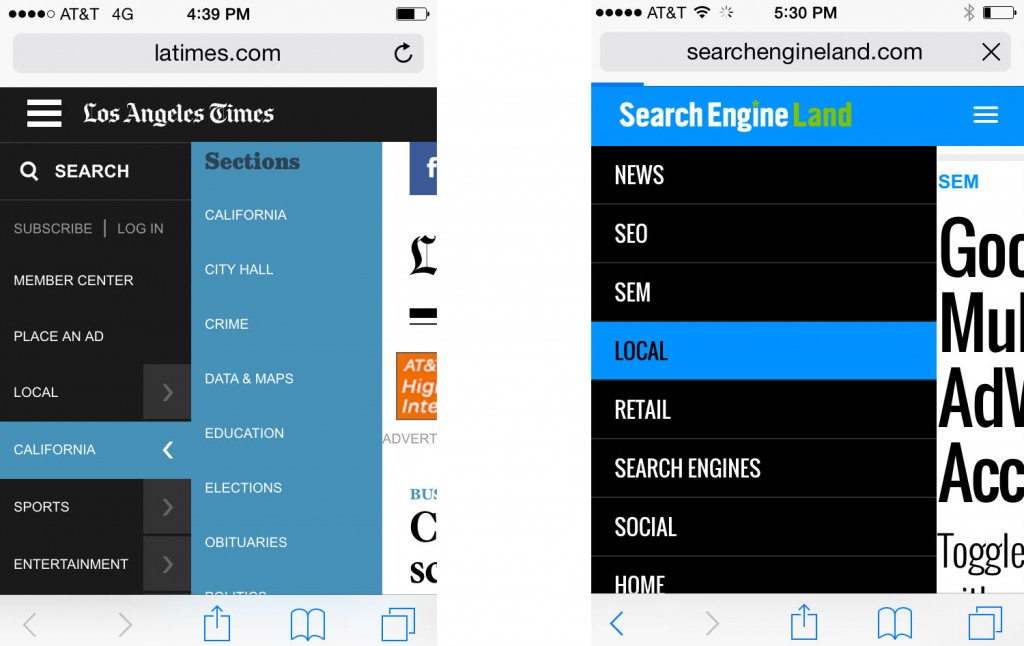 Examples of vertical mobile website navigation
Mobile screens aren’t only smaller than desktop – they’re also oriented differently. Most desktop devices have a landscape orientation, whereas most mobile users view content in portrait. That has implications for a few design choices, the main one being navigation.
Mobile sites are better suited to vertical, rather than horizontal navigation. While it’s true that horizontal is the navigation style of choice for desktop – since it makes it easier for users to focus on site content – vertical navigation is much easier to use on mobile.
In this analysis of navigation styles, 90% of mobile sites used vertical navigation, even though the desktop versions were more likely to use horizontal navigation.
4) Content Prioritization

We said the differences between desktop and mobile go beyond screen size, but let’s face it – screen size is still one of the biggest things to think about when it comes to designing for mobile.
A smaller screen means less room for text, graphics, and other content. So to do mobile design well, you’ve got to bite the bullet and prioritize certain content. That might mean reducing word count, eliminating some graphics, or deferring secondary information to other pages.
Desktop sites can afford to include a wide range of content, but mobile sites don’t have that luxury. The challenge, according to NN Group, is to find the right line to cut between mobile and desktop features. The goal is to satisfy most of a mobile user’s needs, but not include anything superfluous that will negatively impact the mobile user experience – especially elements that will increase page load time on a 3G (or slower) network.
Which leads us to our next point…
5) Situation-based Design

Mobile’s mobility is another major departure from the days of desktop. When website users were all on desktop, designers didn’t have to give much thought to where or how users were interacting with their site. But now, the situations users are in when on their phones are endless. Mobile devices are portable, they follow us everywhere, and they’re almost always connected.
That means that when designing for mobile, thinking through situations is important. Users’ locations vary quickly, as does their attentiveness, and internet connectivity comes in and out. According to the Interaction Design Foundation, ever-changing context means that “users are going to prefer short, simple interactions on mobile. It’s not to say that they will never carry out long, complex interactions but these will be rare.”
6) Integration With Phone Functions
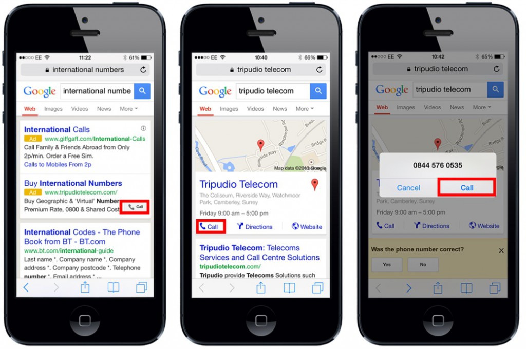
We’ve talked a lot in this post about the things designers have to give up when they’re designing for mobile, but mobile devices have a number of bonus features that can really enhance a site visitor’s experience.
Integration with phone functions, like direct calling and messaging, voice controls, camera, and location services can offer users quicker interactions and more tailored functionality to improve their experience in ways that desktop sites can’t.
Wrap Up
Designing sites for mobile is a whole different kettle of fish, in ways that go way beyond screen size. Users interact with their phones and mobile devices differently – they tap screens, get online on the go, and spend less time browsing – and that requires a fundamentally different kind of website.
