We all love it when things fit neatly together, when the world is aligned. We love it so much that Buzzfeed has collated multiple articles on top-quality serendipitous alignment. We love alignment so much that there’s a subreddit called r/oddlysatisifying.
For all the perceived chaos of the internet, there’s a lot of appreciation for alignment. And that’s because we humans love things to have their place, to be orderly. And that love for orderly things should inform web design.
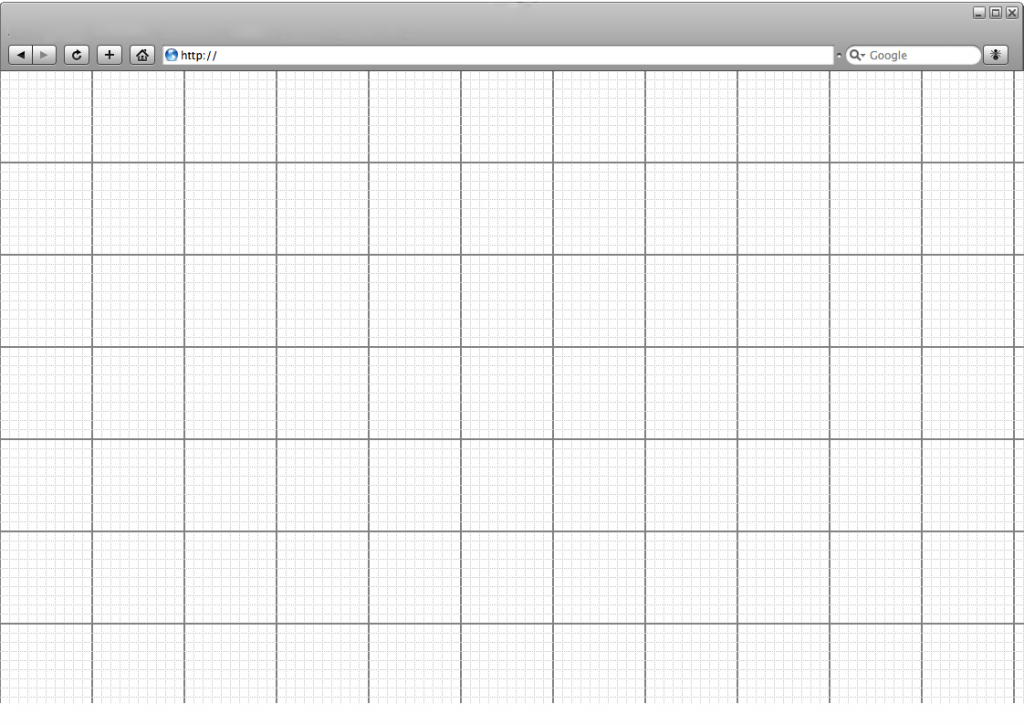
Proper grid alignment
When we talk about grids and alignment, it’s good to get our terms straight. A
grid is when you design
as if a grid is going to sit over your entire page and everything has to be in line with the grid and, therefore, with each other. It’s like building a website out of a series of containers.
When we talk about
alignment, we’re talking about how web elements – body copy, images, headlines, CTAs – sit within that grid.
In terms of alignment, there are really only a few options. For any copy, it can be
left,
center, or
right. Center is good for shorter spurts (like a headline or a CTA) and left is good for longer pieces (in western culture, where we read top-bottom, left-right).
How the copy is aligned within the page as a whole should also be considered: top, middle and bottom. Therefore we end up with a top-left aligned headline, a middle-left aligned paragraph, and a bottom-center aligned call to action. Pretty simple.
Images can be properly aligned or mixed, meaning they can sit inline with text and grids, or float a little within their containers. Generally, properly aligned images will be cleaner, although floating ones may be okay for certain websites (especially if there are lots of images). However, we’d say stick with proper, grid-aligned images.
Why build in a grid at all?
Fair question. A lot of designers and clients feel that designing with a
grid stifles creativity. After all, doesn’t this literally force web designers to think
inside the box?
Well, yes and no. Sure, when you design on a grid and use a uniform alignment, you sacrifice some creativity. You can no longer have a big image splayed diagonally across the whole page with copy written googly all over it. Yes – there are now limits on what you can do.
But this isn’t a bad thing.
Here are the four main reasons why we think grids are a great idea:
- Grids make information easy and fast to interpret
- We live in a world of rectangles – our design should reflect that
- Grids are highly interchangeable
- Grids are responsive
Let’s look at those in a little more detail.
1. Grids make information easy and fast to interpret
When it comes to designing for the web, a designer's goal is to make a product that is eye-pleasing and user-friendly, while also achieving business requirements. A grid format helps them do that. A grid presents information in a way that is easy to digest, both on a visual level and a comprehension level.
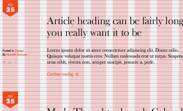
Grids reinforce order, and let the human eye skim and still understand what’s going on. Alignment lets us know where to look to find certain things. For example, on our blog, we left align all our headlines, so that users know to look to the left for headlines very quickly after landing on the page.
On a comprehension level, it’s easier for us to find the information we want if we have a rough idea of where it’s going to be. So for web designers, it’s in their best interest to design a website where the same information is found in the same place in the same format, all the time. Like an ‘add to cart’ CTA, or pricing information.
Imagine, for a second, if every book put the table of contents somewhere different. Some books had it at the start, some in the middle, and some at the end. That makes the table of contents a much less powerful tool, since you’re going to spend ages every time you open a book trying to find the map to tell you where stuff is.
The same is true with websites. If web designers don’t put the same information in the same place every time, it’s a lot harder for users to find it, and as they spend time looking, they’re going to click away.
A grid, especially one with proper alignment, makes it a lot easier to find information because you learn very quickly where to look for it. By building your website in a grid, end users are much more capable of finding what they need and ‘learning’ how to use a site much faster.
2. We live in a world of rectangles – our design should reflect that

We live in a rectangular world (for now). No matter what device you’re presenting your design on, it’s some form of rectangle (
Blackberry Passport aside). So it makes sense that we build websites to match that physical restriction.
That’s why you should build in a grid and align that grid effectively – it reflects the physical limitations of modern devices. Maybe devices will move towards circles with augmented reality devices, or eventually something that works with the new curved screens, but for now, screens are rectangular pretty much across the board. A grid works within those physical parameters naturally.
3. Grids are highly interchangeable
To us, this is the core benefit of the grid –
it makes content and website elements easily interchangeable. For example, you might have an image placed on your homepage, however an image that you’re currently using on your blog would be better for that space. You can very easily switch those images out for one another using a grid format, since they’re going to be built into the website the same way.
A more pertinent example might be your
information architecture. Let’s say you find a problem in the user flow from your 'About Us’ page to your ‘Contact Us’ page. For some reason, people are reading about your company, then checking out your blog, but not visiting your contact page to seal the deal and reach out. With a grid-based site, you can easily add your contact details as a module to your blog posts. It won’t look out of place because there’s consistent alignment throughout your site, and you can alleviate your user flow issues to drive more leads.
Finally, this sort of chopping and changing is far easier with a grid-based design from a technical perspective. A modular approach to web design can enable companies to more easily trial new web flows, and to tweak both images and content quickly and effectively without racking up huge development costs.
4. Grids are responsive
Finally, and perhaps most importantly, grids are exceptionally suited to responsive
design. This goes back to us living in a rectangular world, which is what makes the grid so practical. However, those rectangles are all different sizes, from a big screen TV to an Apple Watch. Grids enable responsive design to create a positive user experience on any screen, and allow the designer to control that experience.
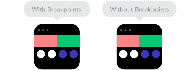
For example, if you have a webpage based on a grid that’s responsive, you can structure it very simply to condense to a mobile screen without adversely affecting the user flow by utilizing breakpoints.
Another reason that grids and responsive design go together so well is that a grid enables a percentage-based scaling system. This is when, instead of having to program each container or piece of content as being a set number of pixels for a given device/window size, you can program each container to be a
percentage of the available screen space, no matter what that is.
So, if you want a hero image and then two columns below it, you can program it as 100% width, 50% width, 50% width. So simple, yet so effective.
And that really sums up why we love responsive design – it allows beautiful designs to exist everywhere, and lets the designer build that experience with precision and care.
Conclusion
Grid design and proper element alignment are very important tools for building a positive website experience. They allow:
- The user to skim, gleaning what they need from a page quickly and efficiently.
- Complex, disparate pieces of information to exist together, like a long list of headlines on a blog homepage.
- The same experience across all devices, with the designer able to control how that experience unfolds.
As we move towards an ever-connected world and are faced with increasing information to process, the grid is going to be absolutely essential in helping us cope with the deluge. It’s a fabulous tool, and when used well, can create a truly wonderful experience and product.
And that’s why we love our boring old boxes.

