Last month in our design trend of the month series, we looked at the grid format for web design, and why it’s useful in so many ways. This month, we’re going to look at another of our 2015 predictions: full background images and videos.
In this post, we look at:
- Where the trend came from
- Why it’s awesome
- Some beautiful examples of great background images and videos
Where full screen backgrounds came from
It’s difficult to say with certainty where full screen images came from, but we’d speculate that they’re likely an expansion of the hero image, plus flat, minimalist design. Let’s look at the first, and then explain the second.
Designers are naturally going to be image-driven people, firm in the belief that an image will better represent an idea than a paragraph of text. Combine this with human’s natural tendency to engage more with enriched media over copy (especially online), and the justification for a large, full screen hero image background becomes apparent – designers want to make them, and users can’t wait to consume them.
Way back in 2010, iStock wrote a blog post talking to various designers about the hero image and they’re all pretty set in their belief that hero images are the way forward. They even cite a usability study on two university home pages that found first-time visitors to a site preferred hero images to lots of content (on the flipside, returning visitors preferred content).
So why did they take so long to take off?
Technology. That’s the recurring answer to both the reason hero images (which are not always full screen) took so long to evolve into edge-to-edge images, and why background video took longer again.
Broadband connections have gotten progressively better, so designers can assume a better speed on average. CSS code has become more flexible, meaning that designers are more able to execute their ideas.
So basically, the idea of turning your homepage into a single story-telling image has always been around, we’re only just realizing the full capacity for it now since it’s only now that tech limitations have eased enough to really play around with video and pictures.
Taking the above logic that:
- Enriched media engages better than content
- Tech barriers of have been broken
The path from a full screen image to a full screen video isn’t that hard to follow.
Why full screen videos and images are the best
For starters, when executed well, they’re really quite pretty. But there are other advantages. It means your website looks superb even on giant monitors, which is a plus since there are a lot of giant monitors out there.
But the biggest strength of full screen images and videos is that they do a great job of telling your story, quickly, clearly, and in a beautiful, engaging way.
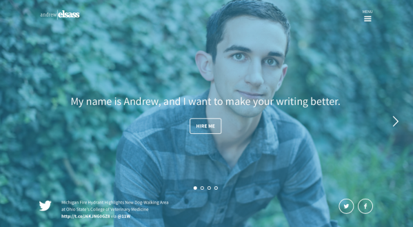
For example, Andrew Elsass is a freelance writer whose site is really effective at instantly engaging audiences with super simple copy and a great full screen image.
Full screen video has the same narrative strength, but with an added level of engagement through movement.
There are other more tangential benefits as well:
- Enriched media has better engagement than normal (as mentioned)
- They work really well on single-page websites
- They work really well with flat and minimalist design, since the focus is on the image, and anything else pulls focus from that image
- For super-saturated markets, like payment processors, your story is what sets you apart. A full screen video tells your story quickly, which might just convince browsers to convert to customers.
So that’s why they’re awesome – essentially, they let you showcase your story in a way that your users want to see it.
Lots of examples
There are dozens of examples of this all over the internet, including posts like 60 Beautiful Examples Of Websites With Full-Blown Video Backgrounds. But here are 3 that really resonated with us.
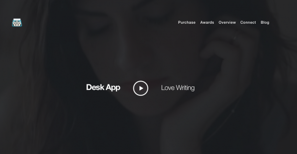
1. Desk
 Click to see video/
Desk is an iOS app that simplifies writing online by removing distractions and streamlining your posting workflow. It’s basically a word processor, but more tailored to blog writers.
Their background video is like the classiest product demo video ever – it’s beautiful people using their product, in settings and in ways that might not be familiar to the target audience, but that the target audience would desire. It sends a clear message ‘we make your life easier’ without coming off as condescending.
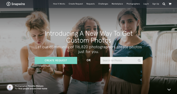
2. Snapwire
Snapwire is a stock image company where you can buy hipster-ish pictures for your website or blog. They’re really beautiful, plus they send out 7 free ones every week to their entire mailing list.
As a photography site, it’s incredibly important that their homepage features stunning images. And that’s what makes their use of full screen images so great. They’ve managed to showcase their product that you can actually buy right from the word go. It’s a super clever and subtle way to say: ‘look what we’ve got for you.’
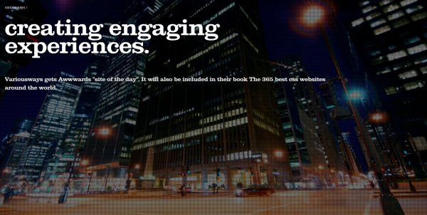
3. Various Ways
 Click to see video background
There’s no story telling or great marketing here – Variousways just created something beautiful.
Closing
Video backgrounds and full screen images tell your story in a big beautiful way, driven by tech advancements that finally let designers realize ideas that they’ve had for years.
While it might not be here forever, we’d recommend capitalizing on this awesome trend while you can.
