Each month, we profile a design trend that we think is notable. This month, we’re looking at ‘the fold.’
Web design has a lot of carryovers from print. We use lorem ipsum as placeholder text, we organize content into columns (first used in newspapers), and even our love for Helvetica started in print. But probably the best known of these is the idea of content that exists ‘above the fold.’
We’re going to look at what it is and why we think that it’s finally on its way out.
What is above the fold?
The fold is a term used in web design today that originated in newspapers. It’s where you put the most important and engaging thing at the top of the paper, so when it’s folded in half on a news stand people can still see it. The idea is that whatever’s above the fold has to be interesting enough to entice people to buy the whole paper.
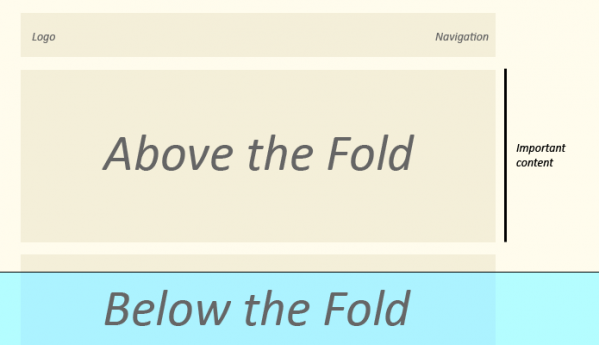
In web design, above the fold is the area of a website that users can see without scrolling, and so is the most likely to grab and sustain attention. It’s usually about 600px.
In principle at least, the fold makes a lot of sense. While it’s a bit silly to peg the idea to something as variable as screen size, the concept of leading with your most important information is pretty solid.
Journalism, for example, will usually follow the simple structure of an inverted pyramid. The core facts and ideas (the most appealing stuff) is first, and later comes the details.
Another example is copywriting with regards to features and benefits. Good copywriting will lead with the most salient benefit. Imagine a drug that made you live forever. You’d put that right on the front of the bottle, not hidden in the fifth paragraph, right?
So there’s no obvious problem with the concept of the fold.
The challenge of the fold for web design
That said, it does present a challenge for web designers. Unlike a newspaper, there is far less physical restriction in web design. So while a newspaper editor might say ‘I want all 10 stories in 20pt font above the fold’ there’s simply not enough space. Physically, it can’t be done.
However, with web design, elements can be crushed and jumbled together, fonts can be made smaller, pictures resized, menus reduced. So while it’s technically possible to fit everything into the first 600px, it’s usually a bad idea to try.
The fold usually gets talked about in the content of web marketing –
landing pages, CTAs, things like that. The prevailing wisdom is that if you put your CTA below the fold, no one is going to buy your product.
Why the fold doesn’t matter
But here’s the thing.
The fold doesn’t even matter.
Here’s what we know.
Jakob Nielsen did a study that found that only 20% of people read below the fold online. That is, are enticed enough about what they see to bother scrolling further.
That might be true, but they’re not stopping because they can’t physically be bothered to scroll –
they’re stopping because they’re not motivated to continue. Of course only 20% of people keep reading! How many times have you been researching something and opened 15 tabs, only to close half of them immediately after you realise it’s not what you’re after? Probably a lot.
The point is that there’s not causal link between where the fold is and whether or not people keep reading – it’s based on how much they want to read, not whether or not they can be bothered to scroll. As noted by
Luke Wroblewski in his article
There is No Fold,
Placing elements at the top of the screen does not guarantee they are visible because people often scroll right away. So just because something is “above the fold” does not mean it gets noticed.
That’s why the fold doesn’t matter, neither from a business perspective not from a design one.
Instead of focusing on whether or not something like a CTA or your logo is in the first 600px, we should be focusing on whether or not what we put first is enticing enough to get people to continue. And to do that, you really need to focus on your core benefits and your value proposition.
How are you making your customers lives’ better, or how are you solving a problem that they have?
Wrap up
The concept of the fold is, well, folding. With more and more traffic being driven by mobile, more and more devices changing how people browse and how they experience your digital property, it’s just not feasible to plan for every single break point.
What’s more, it doesn’t even matter. It’s not about tricking people into scrolling, or about making it as easy as possible to scroll. It’s about creating a compelling enough product that people want to continue to read and engage with.
The fold is on the way out, and frankly we’re happy to see it go.
