As we rapidly approach the end of the year, we wanted to take a minute and see what sort of design trends emerged over the past 12 months. Here are our favourite trends that really hit their stride.
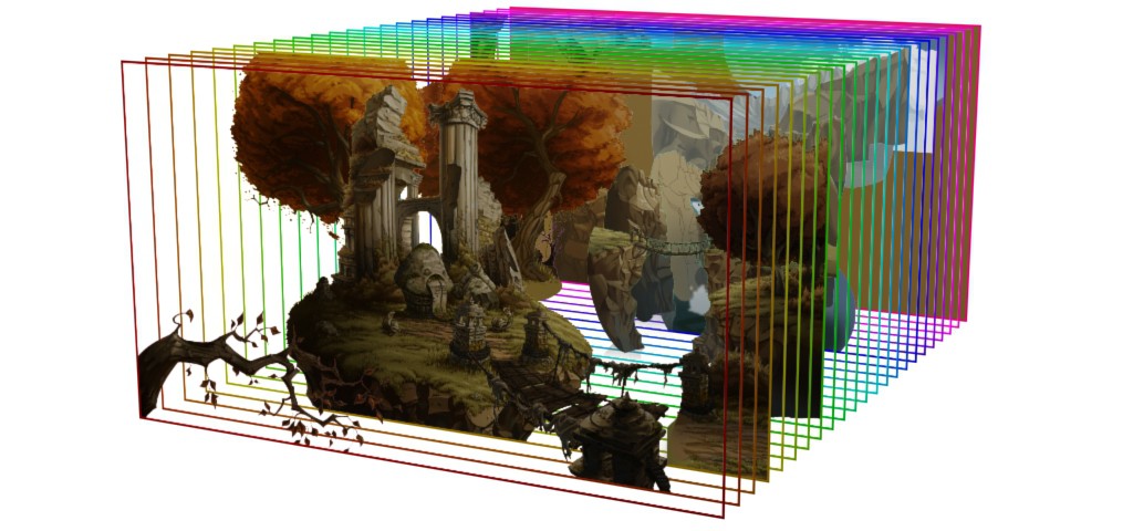
Mixed typography
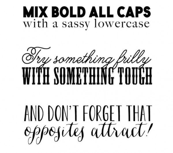 Mixed typography
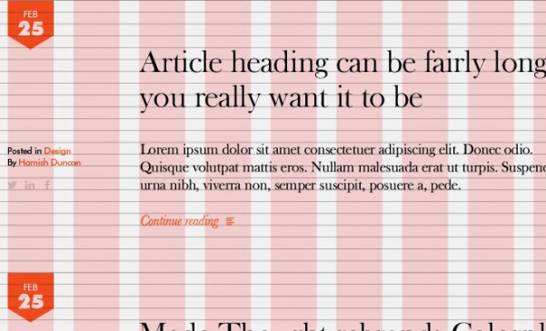
 has been absolutely huge this year. While it started a little further back than January, it’s gained popularity both online and off. It’s a major part of digital and print design today.
What next?
We think that, while it’s powering along now, it’s nearly time to say goodbye to mixed typography. Without getting too cliché, we think that it’s too mainstream, and it’s no longer cutting edge enough for up and coming web designers.
What’s more, it’s increasingly associated more with feel-good messages than with clear cutting copy, so while it’ll keep working for some brands like Walmart, most are going to find it too restrictive for common use.
Hidden menus
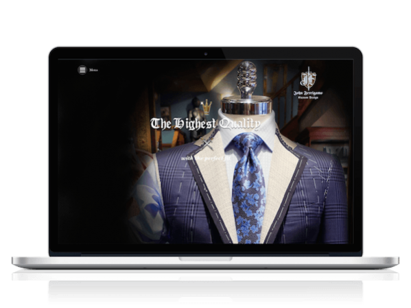
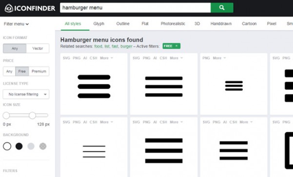 The hamburger
, a navicon, ‘those really mysterious three little lines’. Whatever you want to call them, hidden menus are basically ubiquitous now, a ubiquity that has grown over the last year.
While we’re generally pretty keen for the best UX possible, this is one time when we feel that we sacrificed good UX in the short term for a better long term experience. Let us explain.
The Hamburger (our preferred term) was
heavily criticised when it first hit our screens for:
- Decreased conversions because ‘out of sight out of mind’
- More clicks for the user, and thus more work
- People don’t know what it does
The main thrust of its critiques was that the hamburger increases the complexity of navigating a website for the end user, for a small aesthetic gain.
And while those critiques are true, they’re also dated at this point. The hamburger is so common now that its function is increasingly engrained in the general public. It’s like how we all still save documents to a ‘folder’. It doesn’t really make sense, but changing it to something better would be way too much work.
That’s where we think the hamburger is. A bad idea to start with? Maybe. But we all got used to it, so welcome to the family, hamburger!
What’s next?
It’s here. We think, possibly, forever.
Movement
Movement in web design has been
huge this past year (
although perhaps not in a good way). Whether it’s
parallax scrolling, animated icons, or
background videos, movement is here in a big way.
From a design perspective, we love it. Rich media (e.g. videos) are great for engagement and user satisfaction, it’s great for companies to express their values and products, and it’s great for storytelling.
But recently, the flipside of all that movement is starting to hit home. Increasingly we’re pushing bigger and bigger sites across the same old 3G and 4G LTE networks, and frankly they can’t cope. Site load times are down in 2015 from even earlier in the year, and as users become more and more discerning over load times, they may favour static sites over beautiful animations and videos.
What’s next?
Ultimately, movement in web design is too great to pass up. Eventually, mobile networks will improve, making it easier to deliver heavier payloads to user’s devices, and along with that, hopefully mobile providers will offer more cost-effective data plans for heavy consumption.
The Fold
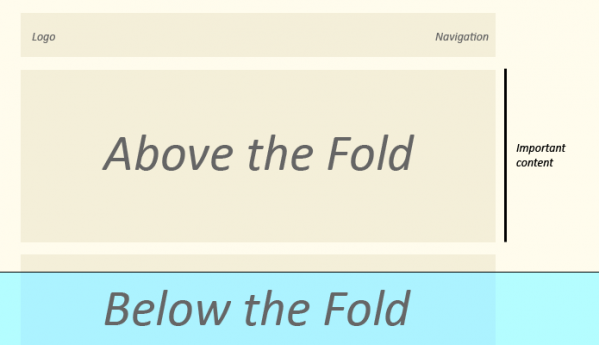 The fold! And how its dying
. What a great trend. Even as 2015 winds down though we continue to cling to the fold as a real life measurement of where to put stuff online, despite the fact that websites don’t fold and screens are all different sizes,
Is it outdated? Absolutely.
Is it relevant? Only tangibly.
Is it going anywhere? Probably not.
But the meaning is (we hope, at least) shifting. Now, the fold is really a dividing line between the essential copy and the nice-to-have details. Basically, it’s a new way of discussing journalism’s inverted pyramid system of writing.
What’s next?
The fold is going to stick around. Probably not as a ‘this needs to be in the first 600px’ type way, but more in an ‘ok, is this important enough to be above the fold? Is it that critical to the user?’ sort of way. We hope at least.
Single page websites
 Single page websites
 have been going strong this past year and they now seem to be poised to be the small business website of choice. The simplicity and structured experience that they provide make them ideal for small companies or freelancers.
However, that same appeal is what keeps them out of mainstream applications, where complex information architecture becomes too much for the limits of what amounts to a single column.
What’s next?
Single page websites will continue to be used by small businesses and freelancers who want a beautiful web solutions quickly, but will not be adapted to larger organizations, aside from maybe the odd micro-site.
Parallax Scrolling
 Parallax scrolling
, or in other words making “visual effect that mimics depth by making the foreground and background elements on a Web page scroll at different speeds” has been deployed by various companies at various times throughout the past year. Burger King, Oakley, and other major brands have used parallax scrolling on individual campaigns, to promote a single unique product or service.
But that’s what we see as the upper limit of parallax scrolling. It’s very cool and engaging and is a fantastic story telling tool, but at the end of the day it doesn’t do a great deal of what a website needs to do. In particular:
- It’s very hard for crawlers to interpret, so they tend not to rank well
- It drives the user at a set pace, when users go all sorts of different paces
- It’s hard to create an actionable CTA at the end
What’s next?
We think that parallax scrolling is going to be treated more like an interesting piece of content than as a website: a good tool to have in your content marketing arsenal, but not the core to your digital presence.
Full Screen Images
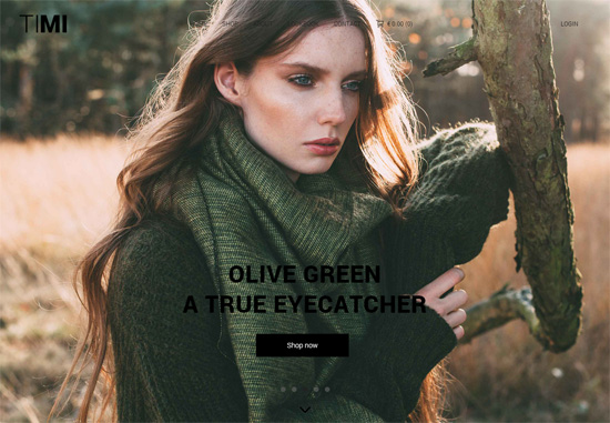 Full screen images
 have been a major trend over the past year. Just two examples are the websites of
Strava and
Slack, but there are literally hundreds out there.
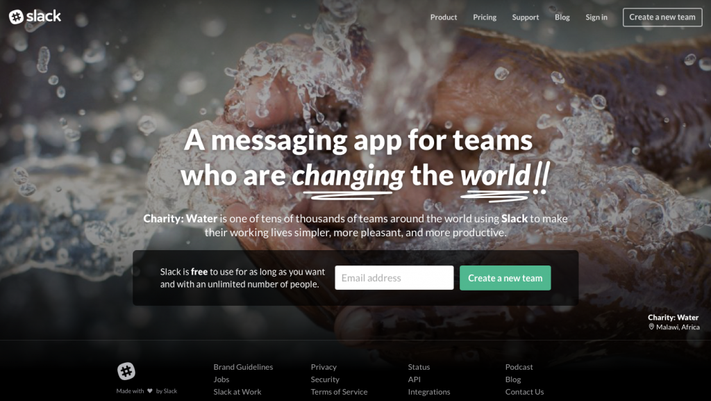
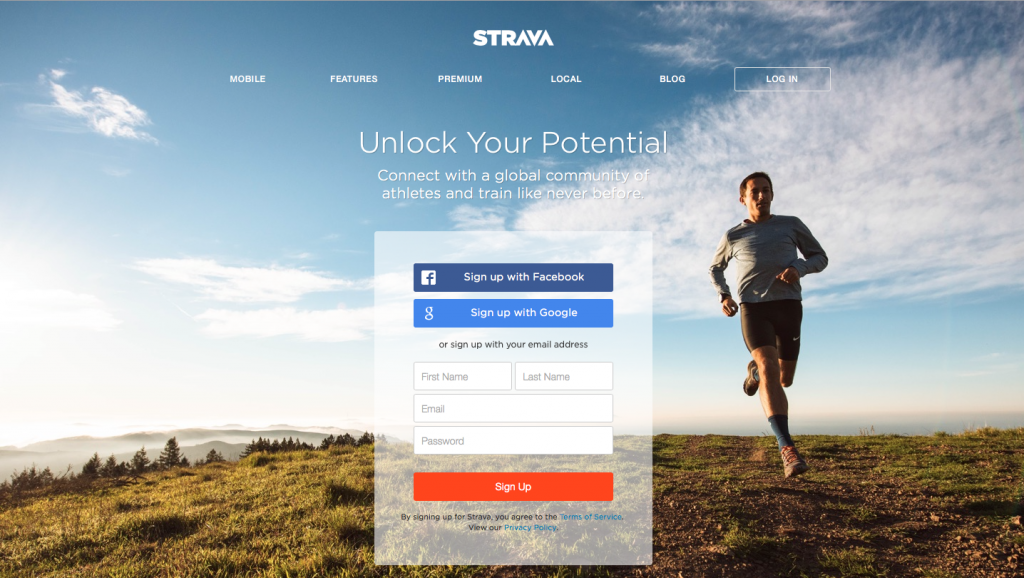
Full screen images have the appeal of looking fantastic no matter how big or small a screen is as well as providing a huge canvas to entice customers further into the website. Plus, they allow companies to drive home their values and their benefits without being over-the-top salesy in copy.
All in all, full screen images are a major hit, and one that we hope continues.
What’s next?
We think that they’re here to stay – and maybe even increase in popularity – as companies shift from background videos and back to stills over
website weight concerns. Plus, how good do those pictures look on retina screens? Seriously, how good??
The Grid
 The grid
 – the design pattern of old coming back for another round. Since early 2013 or 2014, more or less
whenever flat design took off, the grid has been by our side. It’s a simple way to organize complex and disparate pieces of information without confusing the reader.
Newspapers used grids as the backbone to their product for decades, and we think that web design is no different. It’s simply too convenient to fade into obscurity, especially for complicated sites like news sites. It’s also found a home in visual social media, like Pinterest and Instagram.
What’s next?
The grid is here to stay. It’s flat, it’s simple, and it’s clear – everything the 2015/2016 web designer could want.
Summary
It’s been a good year for
web design. We saw what we could do, we pushed the boat out a bit with animation, video, and parallax scrolling, we embraced the new (hamburgers) and cut out the useless (the fold). We’re pretty happy with how our year went!
So what’s in store for next year? We’ll just have to wait and see.
