Jakob Neilsen, the UX guru, design genius, and human factors extraordinaire, created 10 principles of interactive design. And when it comes to designing for digital platforms, if you follow these 10 principles, your designs will sing.
1. Give users feedback

You need to make sure your design tells the user what’s going. And the design needs to convey such message at each and every stage.
A very simple example is a loading bar with the estimated time remaining. It tells the user:
- What’s going on in the system (it’s loading)
- How long it’s going to take until something else happens
Other methods of telling the user what’s going on include:
- Haptic, audio, or visual feedback
- Load screens
- Error messages
2. Use what the user knows already
Design your interaction so that it mirrors what happens in reality.
One way to think about this is by imagining your user is walking around a city. If you make your experience totally new, like visiting a new city, the user has to use a map to figure out how to get where they need to be – and this can take a long time.
However, if you make your experience like something they’ve already done before, like a city they’re familiar with, they’ll know exactly where to go.
One example of this is ecommerce purchase journeys. The language used on most commerce sites is like a traditional brick-and-mortar retail store – shopping cart, checkout, add to cart, continue browsing.

Second, purchase journeys follow the same steps as buying something in reality, in the same order. You can’t check out before you add something to your cart.
3. Support the undo
Nothing is perfect the first time. Or, sometimes the second. Or the tenth.
Designers need to provide users with easy undo options. When a user makes a mistake, being able to make changes without starting all over again is very important.
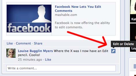
For example, Facebook lets you edit comments shortly after you post them, to make it easier to fix all those messy typos. When they are presented with the option to undo, the user more likely to commit to an action.
4. Be consistent
Be consistent, always.
The buttons with the same actions should look the same across the board. Same shape, same size, similar location.
Call to actions should always be the same colour (exceptions allowed for A/B testing, of course).
Users expect the same action to get the same result each time they do it, and the design should facilitate that.
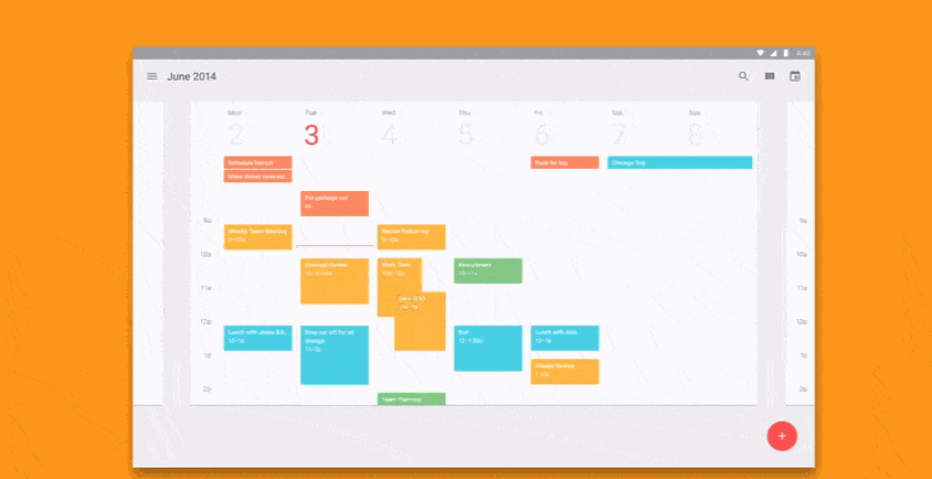
The best example of this is Google’s Material Design. Google has worked hard to standardize every aspect of its design so that users get the same experience, regardless of which Google platform they are using – whether it be Gmail, Google Docs, Analytics, Chrome, or otherwise.
5. Preventing a problem is better than fixing one
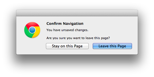
It’s better to prevent errors before they occur rather than deal with them later.
Not every error will be possible to avoid, but with careful attention to how you craft process flows, you can design out a large number of them. Some ways you can do this include:
- Add confirmation messages before crucial steps (e.g. right after you click ‘buy now’)
- Offer suggestions for searches to avoid typos
- Choose good default settings (less changes = less mistakes)
6. Recognition vs recall
Recognition is when you recognize something as familiar when the information is presented to you.
Recall is needing to remember what something is, without necessarily being prompted with any hints or clues.
Nielsen provides an example to illustrate the difference between the two:
- Recognition: Did Herman Melville write Moby Dick?
- Recall: Who wrote Moby Dick?
Good design should play heavily on recognition – it’s far easier for a user to recognize something than to recall what to do.
In real terms, this means that you shouldn’t be asking users to remember (and then recall) information from one screen to another. What’s more, you should be relying on recognition in general to inform design.
For example, laying out a website so it looks the same as all the other websites might not be very creative, but it means that a user doesn’t have to recall how you use your specific site; rather, they recognize a traditional website structure and have a good idea of what to do – for example, where to find the main menu.
7. Use shortcuts
A problem faced by many interaction designers comes from designing for wildly varying skill levels.
How do you make a system usable for every level of user, from novice to expert?
The answer is shortcuts, or accelerators. These are how novices can use a system comfortably, but expert users can use the same system and not feel constrained.
Microsoft Excel is a superb example of this. Novice users can use it (relatively) easily; however, there are so many shortcuts that expert Excel users rarely even need to use a mouse, leading to much faster use and a better experience.

8. K.I.S.S.
Keep it simple, stupid. It’s easy to overload users with information, and as they wonder want to do, they’ll wander away.
Good design is ruthless in what it cuts out, so only the most relevant information remains.

For some brilliant examples of this in action, take a look at any road sign. The stop sign, for instance, tells drivers everything they need to know, and nothing they don’t. Its communication could not possibly be improved on.
9. Make error messages actually useful
Error message should do two things:
1. Tell the user what the problem is.
It needs to be clear to the user what the problem is and what’s happened to cause that problem.
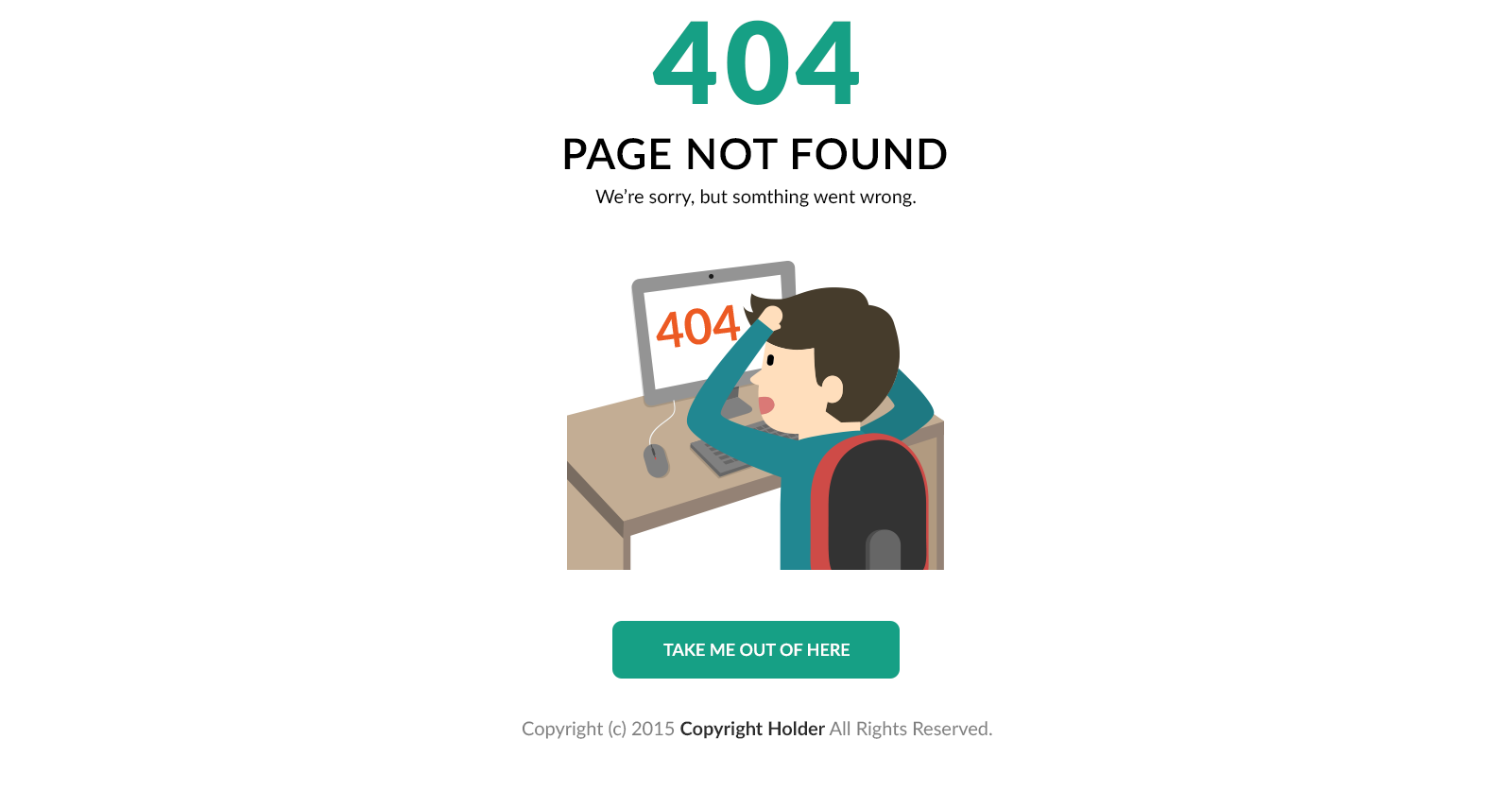
For example, a 404 Error page is fairly useless if all it says is 404 Error. What if the user doesn’t know what a 404 Error is?
Rather, it should say something like ‘that link is broken or no longer available.’ That way, the user actually knows what went wrong.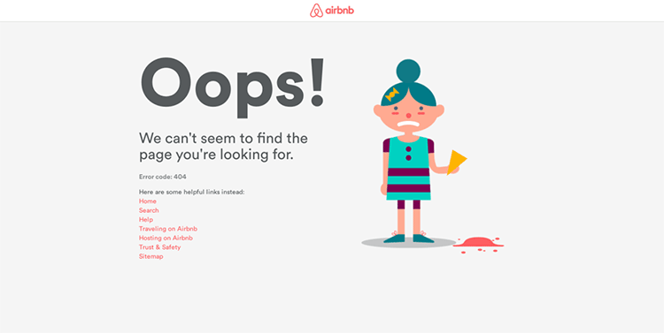
2. Give the user a possible solution.
It’s disheartening when you’re using a service and you receive an error message without a solution. Sure, you might understand what caused the problem, but that doesn’t mean you know how to fix it!
Error messages should also present a solution, or a suggested course of action.
For example, for a 404 Error, this might be giving users the option to go back one page, or to a sitemap.
10. Help and documentation
Even the best designs can have hiccups. Instead of leaving users floundering, systems should come with help documentation in place should things go awry.
Help needs to be:
- Searchable. People need to be able to find what they’re looking for, quickly.
- Easy to understand. Not everyone is going to be a pro-user.
- Provide step-by-step solutions. Anyone can follow a recipe.
Wrap up
Jakob Neilsen originally wrote these 10 principles of interactive design over 25 years ago as a guide to completing a heuristic evaluation.
Despite the significant technological changes since that time, these have remained (with updates of course) both a relevant and extremely valuable resource.
And for that, Dr. Neilsen, we thank you.
