Psychological principles are easy to overlook in the design process – at first glance, they seem complex and unnecessary for doing great design work.
But psychology-based design is worth a second glance.
Understanding the basic drivers of human behaviour will help you improve how visitors engage with your site, respond to calls to action, and feel about your website and your company.
It will also help you achieve one of the basic goals of good design: to get your users to follow the journey you've built for them whether it’s clicking a link, signing up for a newsletter, or buying a product.
So what are the main ideas you should be borrowing from psychology to improve your design process?
Here are our top five.
1) Familiarity and Patterns
via
tutsplus.com
What it is
The human brain loves a good pattern. When users land on a website, they look out for familiar and recognizable patterns that will help them take mental shortcuts, make judgments, and figure out what their next move is.
Plus, any website that has familiar features and patterns will seem more trustworthy and credible.
How to implement it
Patterns are everywhere in the online world, from site-specific patterns to more general, internet-wide patterns.
You can create your own patterns for your particular website by being consistent with your choice of colours, fonts, page layouts, image styles, and formatting. Users will learn these patterns and have a better experience with your site because of that.
But following the larger patterns you see all over the internet is also important for boosting your site’s credibility and your users’ perceptions.
It might sound counterintuitive in an industry that loves creativity and innovation, but good design plays by rules that users are familiar with.
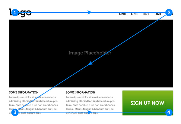
For example, displaying important information in a ‘Z’ pattern (more on that here), using standard blue hyperlinks, or providing an ‘about’ page will give your users patterns that they recognize instantly from other websites, and make them feel more comfortable using yours.
2) Emotional Triggers

What it is
Emotions are a strong driver of behaviour. Everything from anger, to gratitude, to guilt, to a sense of belonging influences how people behave and the decisions they make. Online, those emotions can trigger people to buy a product, share your site, or get in touch with you.
How to implement it
Text does a lot of the heavy lifting when it comes to triggering the emotions you want. But design features like images, fonts, and colour choices can be used to strengthen the emotional triggers in a site’s copy.
Images in particular are a great tool for reinforcing an emotional trigger. Using an image that complements the text’s message makes site visitors more receptive to your message and your company, and it will elicit a more emotional response than text ever could on its own.
A word of caution though: if an image isn’t congruous with the message or emotional trigger you’re trying to convey, your user will end up confused and you’ll lose credibility and trust – choose wisely!
3) Color Psychology
What it is
Colour psychology looks at how specific colours and colour combinations affect behaviour.
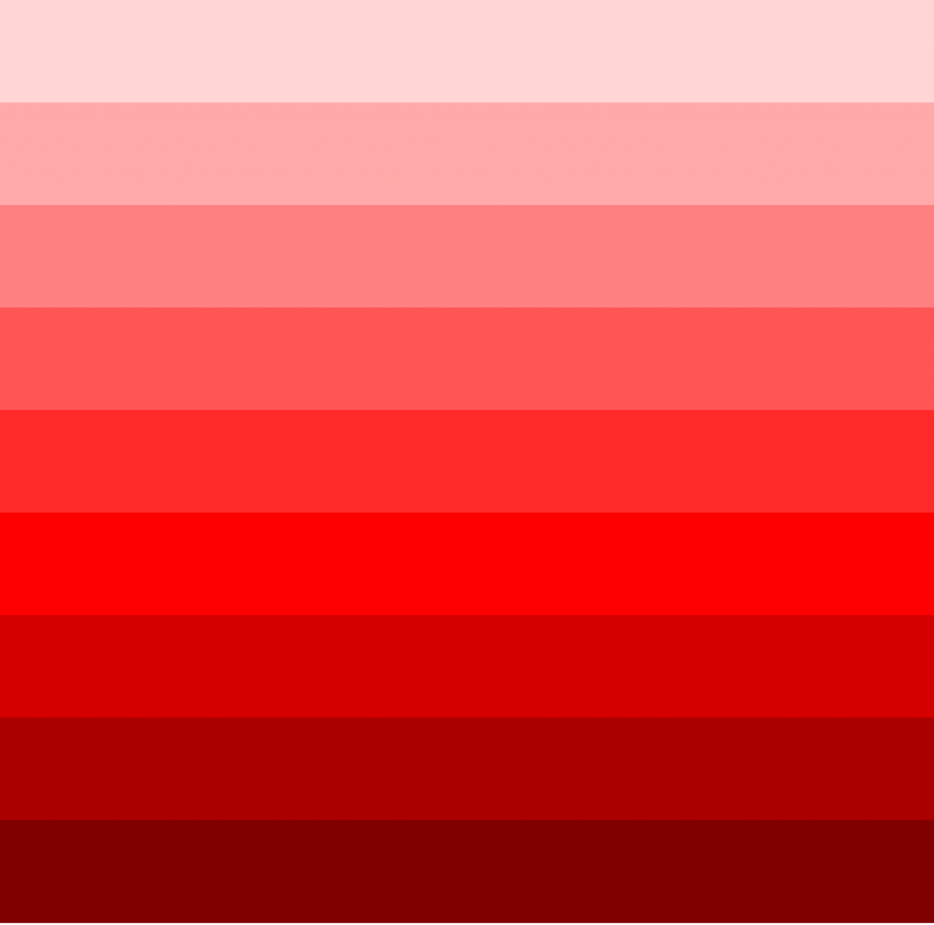
We’re all familiar with the idea that particular colours elicit emotions – red is passion, yellow is warm and happy, white is pure, etc. – and you can use this to your advantage to amp up the emotional triggers we just covered.
Colour psychology is a complicated idea in design psychology, so we can’t do it justice here. Check out our recent post all about colour psychology to read about it in detail.
4) Social Psychology

What it is
Social psychology looks at how people interact with each other. Even though we all get online from separate devices, people love to feel a sense of belonging, trust, and validation in the online world as much as they do offline – and a good site design can capitalize on that.
How to implement it
Use graphics, language, colours, and images that make site visitors feel like they’re included in some kind of online community, or in the more personal inner-workings of your company.
Have you ever wanted to stay on a website that used generic, corporate stock images and uptight, impersonal copy and graphics? Probably not.
But people also get a sense of belonging by landing on a site that feels familiar, trustworthy and popular – try using those all-important familiar patterns from the first point to achieve this.
5) Hick’s Law, Focus, and White Space

What it is
Have you ever been to an ice cream shop with 150 flavours and spent an hour deciding what to order?
You can explain that with Hick’s Law, the idea that the more options a user has, the longer they will take to make a decision and find the information they’re looking for. That’s fine for an ice cream shop, but it’s something you want to avoid on your site.
Too many options or an information-overload will overwhelm users, and make their choices and actions harder. It also means that your calls-to-action probably won’t get a great response.
How to implement it
You can avoid this problem by making sure that every page on your site has a clear focus and an obvious purpose.
Don’t try to load all the information, images, and graphics you can onto one page. First off, it will look bad. But secondly, your users will end up overwhelmed and ready to give up on your site.
Instead, you can use ample white space to give your users clarity, focus, and room to think.
Even though white space is left empty, it’s a great tool for directing site visitors to look at certain things, focus on strategic content, and nudge them into taking desired actions.
Wrap Up
Understanding some of the basic principles of psychology can be a great tool for improving your design game, and knowing what makes your users tick is a great way to ensure your site will achieve its goals.
There is a lot to learn about the psychology of web design, and these five ideas is a good place to start.
If you want to check out some more in-depth resources on this topic, we’ve got some great psychology and neuroscience-related titles in our summer reads book list.
