Connecting to the internet has become possible through an entire ecosystem of devices, each with their own sets of challenges and peculiarities to keep in mind. In addition to different sized viewports and the need to implement responsive design, differing resolution and pixel ratio in recent years has also become a factor in web development.
Things have changed a lot since the days of print media when everything was measured in inches. For a while, web designers and developers used pixels as the standard measurement for type and sizing, but this changed with the arrival of tablets, smartphones and smart HD TV sets. Pixels don’t necessarily correspond to the size of the screen – they can be smaller, thus delivering a crisper image, or larger, thus more standard.
A good illustration of this fact is that the smartphones in our pockets now have way more pixels than the Jumbotron screens that used to be littered along Times Square. This means that the image is sharper and more realistic than ever, as more pixels mean less ‘blockiness' as each individual pixel (smaller) is harder to see independently from the image it helps form.
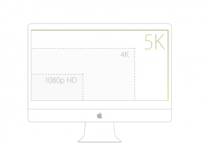 Recently, Apple, among others, has come out with HiDPI, or High Density Pixel devices. The much talked about ‘Retina screen’ refers to these, and the latest iPhones, Androids, MacBooks, and even the Kindle Fire, all have HighDPI screens. What this basically means is that the number of pixels on these devices is doubled but fit into the same physical size of the screen. This means a clearer picture quality; however, a bit more work for web developers who want to make sure their work looks good on all devices.
Because there is double the number of pixels on HiDPI screens, all raster based background images and graphics will be scaled up 2x their size as well. Web designers have to keep this in mind with their image sizing, and maybe substitute bigger images for smaller screens using fixes like media queries or by using scalable SVG images instead.
Just this month, the iPhone 6 Plus introduced a Retina HD display, which has, again, more pixels than the previous display resolutions. This means that designers will have to keep this in mind for future web builds. As opposed to just last year, in this fast growing industry, we now have to have three image assets in place for each resolution (regular, retina, and retina HD).
As mentioned, a good way to guarantee standardization between all devices is to simply use vector based images, otherwise known as SVGs (Scalable Vector Graphics). This means they can scale to any size and will not become pixilated. Images edited in Illustrator can be exported as SVGs for easy use. Their colors and other attributes can also be changed without the use of photoshop or other image altering programs. Because SVGs are just vectors (math-based coordinates), they’re essentially comprised of code that can easily be edited right in the text editor that will change the colors, sizing, and positioning instantly.
As new technology emerges and old ones change, there will always be new challenges in delivering a great user experience for your platform’s users. However, there are also always new solutions. The case of the Retina and Retina HD displays are a great example of this.
Keep this in mind when designing new websites as user experience takes priority over everything else.
Recently, Apple, among others, has come out with HiDPI, or High Density Pixel devices. The much talked about ‘Retina screen’ refers to these, and the latest iPhones, Androids, MacBooks, and even the Kindle Fire, all have HighDPI screens. What this basically means is that the number of pixels on these devices is doubled but fit into the same physical size of the screen. This means a clearer picture quality; however, a bit more work for web developers who want to make sure their work looks good on all devices.
Because there is double the number of pixels on HiDPI screens, all raster based background images and graphics will be scaled up 2x their size as well. Web designers have to keep this in mind with their image sizing, and maybe substitute bigger images for smaller screens using fixes like media queries or by using scalable SVG images instead.
Just this month, the iPhone 6 Plus introduced a Retina HD display, which has, again, more pixels than the previous display resolutions. This means that designers will have to keep this in mind for future web builds. As opposed to just last year, in this fast growing industry, we now have to have three image assets in place for each resolution (regular, retina, and retina HD).
As mentioned, a good way to guarantee standardization between all devices is to simply use vector based images, otherwise known as SVGs (Scalable Vector Graphics). This means they can scale to any size and will not become pixilated. Images edited in Illustrator can be exported as SVGs for easy use. Their colors and other attributes can also be changed without the use of photoshop or other image altering programs. Because SVGs are just vectors (math-based coordinates), they’re essentially comprised of code that can easily be edited right in the text editor that will change the colors, sizing, and positioning instantly.
As new technology emerges and old ones change, there will always be new challenges in delivering a great user experience for your platform’s users. However, there are also always new solutions. The case of the Retina and Retina HD displays are a great example of this.
Keep this in mind when designing new websites as user experience takes priority over everything else.
