One of the most popular web design trends of the past 12 months is sticky navigation - that collapsed navigation menu that appears at the top of your browser window regardless of how far down the page you scroll.
Facebook has it. Twitter has it. Google has it. We have it.
And with good reason. A usability study performed by Smashing Magazine found that persistent nav is 22% quicker to navigate, and 100% of users preferred sites with persistent navigation without even knowing why.
Now, a new trend of “hiding” the sticky website navigation when you’re scrolling down makes the feature even better, by presenting it only when you are looking to use it.
For an example, check out MailChimp’s blog. When you scroll down the page, the navigation disappears. If you stop and scroll back up, it reappears. If you hit the bottom of the page, it reappears.
This may seem like a trivial feature if you’re viewing the site on a desktop computer, but MailChimp’s site – along with many others that use sticky nav – are responsive. So if you’re viewing the page from a smartphone or tablet, and the page has sticky navigation, you’re losing some valuable screen real estate. The solution of “smart” sticky navigation that only appears when you need it solves that problem.
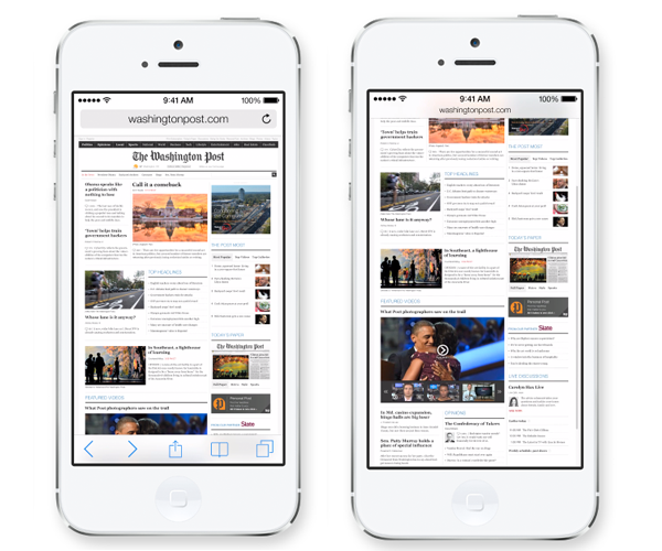
Apple has even recognized this, touting the ’smart’ navigation controls as one of the best new features of Safari (the mobile browser) on iOS 7.
 Keep this new web design and usability trend in mind when planning your next web project.
