“Keeping up with the Joneses” has never been harder for businesses in today’s digital economy. It seems like every day there’s a new web trend, a new Google update, or a new customer segment that needs to be catered to.
As a result, we’ve seen a number of brands relaunch their identities and redesign their digital properties to better align with a new personality. Today, we’re going to look at the best way brands can stay up-to-date without sacrificing their brand value, and what they can learn from Uber’s recent redesign.
Why it’s important to update
To stagnate is to die. That’s what it comes down to. Painful? You bet. But it’s a necessary pain. This cycle of constant updating and iteration is driven by two core factors.
First, customer demand. Especially for digital properties, consumers are comparing your brand against all of the others they engage with. The standard your site is measured by is set by whoever is the best, most on-trend, most innovative company at that point in time. That sort of daily, instantaneous side-by-side comparison is a new feature on the corporate landscape and one that’s driving more rebrands than ever.
For example, imagine you sell shoes and you have an online app. Your app logo is a little dated, but you think it’s either ‘good enough’ or not worth the investment to worry about. The problem is that on a mobile phone screen, your old, dated logo is going to be compared to all the sleek, beautiful logos that it shares the screen with. As a result, your brand value and possibly your bottom line suffer – because you’re not on trend.
Second, technological innovation. Technology improves at an incredibly fast rate. We can now do things that could never have been done even two or three years ago. For example, before 2014 there were very few video hero images. Not because no one thought of it – but because mobile data was slow(er) and hadn't yet figured out how to build sites with hero images and a positive load time.
So, with technology continuously improving, brands are presented with more creative options to tell their story. Coupled with the aforementioned consumer demand and comparison ecosystem that all of our digital work lives in, there’s huge pressure to keep up.
How to stay up to date
The key to staying up to date is to always be improving, but also knowing when you actually need to update what. For example, at some point updating your logo will be important for your brand -but just because you're updating your logo doesn't mean it's also a good time to change the iconography in your app. It’s best to accept that it's not feasible to change everything each time a new trend comes out. It’s better to update incrementally and improve your app or website as you go.
So how do you know what to update? Here are two ways we keep up to date.
Study competitors
See what your competitors are doing. Pay attention to the leading apps in your vertical, how they're evolving and what their customers like best about their apps by checking out their reviews. If you’re not sure where to start with finding your competitors, try searching your brand’s most relevant keywords in the iOS App Store of Google Play Store.
Have an aspirational company
It’s still good to follow a company whose design you love, even if they are outside of your industry. Keep an eye on them, you might not be able to adopt all of the features you like but keep returning as a source of inspiration. Following progressive companies is also a great way to see what's at the leading edge and what early adopters are moving on. Some companies whose app design we love include:
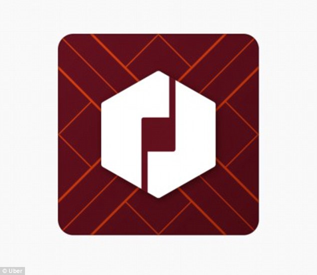
Uber app: a brief case study

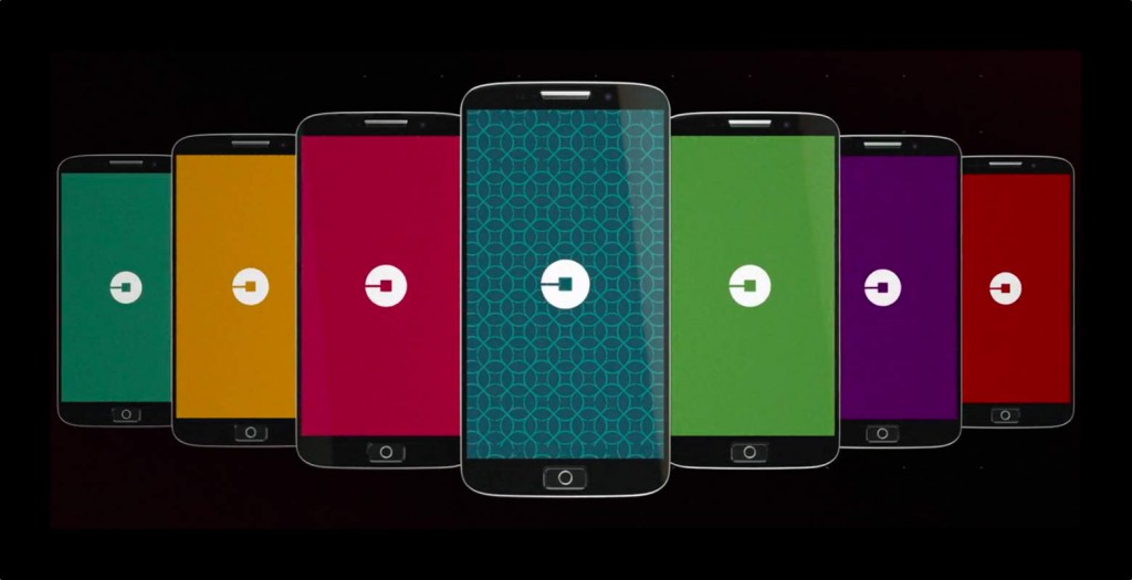
Uber has renovated their brand a couple of times over the years, but the 2016 rebrand is certainly the most radical.
Gone are the traditional curly letters and the big ol’ U. Gone are the stark black and white contrasting colours.

In its place is a new palette of muted greys and blues, and in the place of the U is what the CEO is calling ‘the bit’ – a stylised hub that as Uber moves into more products, you’ll always see that ‘bit’ and know that it’s Uber.
Uber’s coated this rebrand in all the normal flouncy language – they’ve outgrown their old brand, they want to be a dynamic company, they want their brand to be a better embodiment of what Uber stands for.
But really, Uber’s rebranded for two main reasons.
First, their old look was dated.
Second, Uber had grown beyond its original brand. It is no longer just a pseudo-luxury transport but a giant multinational conglomerate, with different sub-brands and services like UberX, UberPOOL, and Uber Eats for food delivery. The company needed a more effective way to communicate that it is part of one cohesive transport solution. Plus, it needed some underlying core design so that people can recognize a service is Uber straight away.
For example, the new design allows them to put different shapes into their logo depending on whether they’re communicating with drivers, passengers, or other customers, the idea being that even different user groups are still on brand.
Initially, feedback has not been positive. Yes, this achieves Uber’s goals of keeping up with trends and developing a logo that’s versatile enough to grow with their company.
However, so far it looks like they overshot a little on how much to change at one time. As a result, they’ve ended up in the awkward position where, if they keep the logo, their brand sentiment will suffer, but if they scrap the logo, their brand credibility will suffer.
In other words, they’re stuck between a rock and a hard place, and the only way out forward is to stick it out with the rebrand and see how it plays over the long term.
Conclusion
Web trends move at a rapid pace, driven by both consumer needs and technological ability. As a result, it’s no longer an option for a company to sit on its haunches and let its brand become dated in the digital age.
Brand maintenance, renovation, and redevelopment should all be part of the long-term plan for a company. However, as we can learn from Uber’s recent redesign, whenever you’re dealing with something as delicate as a brand, it’s critical that you tread lightly; Yes, it’s important to stay up to date, but try and change too much, too fast, and you’re liable to get an earful from your most valuable asset you have – your customers.
