Designing converting websites often feels more like guesswork than a hard and fast science.
Often, it feels like there’s no right answer to these sorts of questions, and it’s just a matter of clawing away at 2-3% improvements. And in a lot of ways, that’s true – there is no “right” answer.
That said, there are definitely some guiding principles. Here are three tips for how to design websites that convert.
1. Don’t reinvent the wheel
As much as we love creativity, there’s a time and a place. And whether we like it or not, most of the time in design it is not the time nor the place.
See, as humans grow up, we accumulate experiences. We then use those experiences to make decisions and inform future behaviour. For example, if we touch an element on a stove, we burn our hand. We rely on that past experience to know it’s a bad idea to do it again.
The same thing happens when people make decisions online. We rely on our past experiences with user interfaces (UIs) to know what to expect and what to do.
For example, most ecommerce checkout pages look the same. It’s a perfectly functional design right now, but there might be a better way to do it. The thing is, we all recognize what to do when we get to the page
because of our past experience.
[caption id="attachment_3353" align="aligncenter" width="800"]
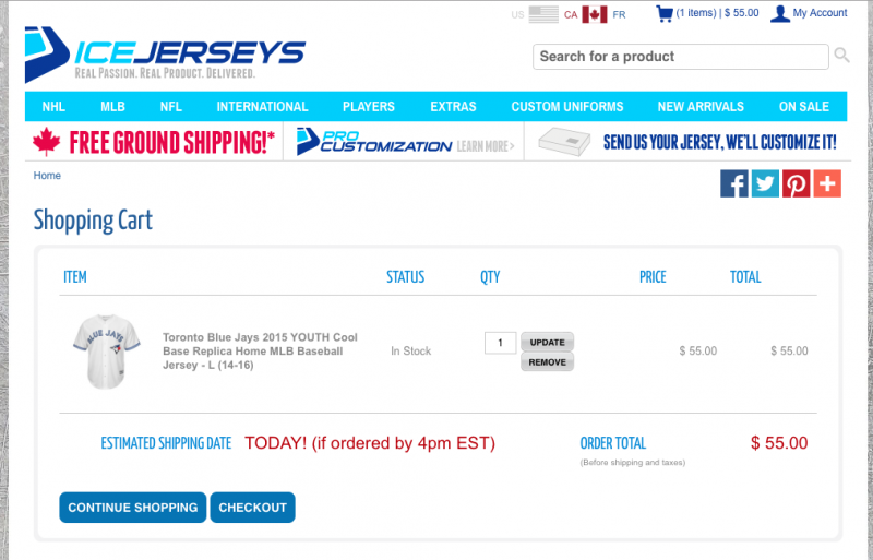
You know what to do on this screen.[/caption]
While you might want to totally redesign the checkout page for your ecommerce site, if it doesn’t look like a checkout page, then people aren’t going to know what to do.
And confusion is
not an ingredient in the conversion pie.
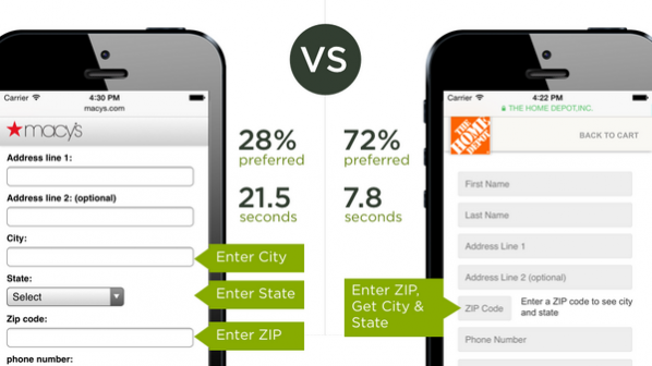
2. Design to reduce friction
Good design makes things easy. For example, a well-designed user experience just seems to
work. This should be a driving factor when you’re designing online.
When we talk about conversion rates, we’re really talking about how many people did what we asked them to do when we asked them to do it. That’s it.
So if you’re asking someone to do something, you want to make it as
easy as possible for them to say yes.
To demonstrate this, imagine that your friend is moving to a new house, and has asked you for help:
“Hello friend! I’m moving this weekend, and was wondering if you could help me out. It’s a few hours on Saturday, and I could really use an extra set of hands. I’ll pick you up at 9 at your place and should have you back by 12.”
That’s the first request. Here’s the second:
“Hello friend! I’m moving this weekend, and was wondering if you could help me out. Should take most of Saturday, and it’ll be just you and me. Also, can you pick up the moving truck by 6am?”
Which one would you say yes to? The first one of course! The second one has far more friction and roadblocks to saying yes that the first one.
When you’re driving conversions, the same thing happens – more friction means less people saying yes. So make it easy! There are really only two ways you can reduce friction:
- Reduce the cost
- Increase the benefit
Here are some ways you can achieve those goals:
3. Design simply
The human brain does not like complexity. At all. We get overwhelmed by it, distrust it, and instinctively shy away from it. It’s why
we all love orderly grids of information or why this
Buzzfeed article or 24 super-orderly things has been viewed over 900,000 times.
Complex ideas might hold a nasty surprise, which is why we love simplicity.
That should be reflected in your visual design. Using white space, grouping similar ideas together, grouping similar patterns together, and simplifying and editing everything is going to help you drive your conversions.
There’s beauty in simplicity. So get editing.
[contextly_sidebar id="CJdcivtPOV8pEmmr0iE8exoOa6zlJbG3"]
Conclusion
There’s no guarantee that a website is going to convert. There’s no magic formula that’s going to ensure that your website gets the results you want. In part, it’s going to depend on what you’re asking people to do and what you’re giving them in return. If your site is asking people to run naked through a swarm of angry bees and get nothing in return, then you’re not going to see a lot of takers.
That said, there are plenty of underlying psychological ideas that can help designers understand why people behave the way that they do. Principles like:
- People like to know what’s going on, and they have a better idea of what’s going on if they’ve experienced something before
- People like things to be as easy as possible
- People like simple things more than complex things
If you can apply these pretty intuitive principles to your design work, you’re much more likely to get the yes when you ask people to do stuff.
