Buttons are so ubiquitous that we hardly even think about it when we use them.
Calls-to-action (CTAs), ‘buy’, ‘add to cart’, subscribe – they are the ground zero of user interaction, and are one of the most important features of web design.
And while a good button needs clarity in its design, copy, and context that will be entirely unique to it, the different states of a good button are pretty universal:
- Resting
- Hovering
- Clicked/active
Let's look at these in a little more detail.
Resting
Resting is what the button will look like before anything happens to it. It's the state that button is going to be in most of the time, and the state that will tell users what it does. This is arguably the most important state. You don't want your users interacting with your website or app on a trial-and-error basis. A user should never interact with your button thinking ‘gee, I wonder what this does’ and a user should always know that a button is, well, a button.
Achieving this isn’t that hard either. Contrasting colours, clear copy (e.g. ‘subscribe’ instead of ‘stay informed’), plenty of space and context will all help. An added bonus with the resting state – there's no need to reinvent the wheel: since everyone uses buttons, there are
literally hundreds of great examples out there.
One thing to note when you’re thinking about resting buttons: if you’re designing something that you want people to click on, make it super clear what it is, even if your actual click-throughs go down. Better to have less traffic that wants to be there then more traffic that ended but there because they took a wrong turn.
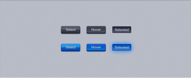
Hovering
This is what the button will look like when someone is hovering over it with a mouse. This particular state has seen a decline in sites and apps that are designed mobile first, simply because it’s not needed on a mobile screen. Plus, with flat design’s emphasis on sharp lines and high contrast, it's always pretty clear what is and is not a button.
A really easy example of the hover state is when you mouse over a hyperlink and the underline appears. Same concept.
It’s an important state because it provides the user with feedback. It lets the user know that the device is ready to be clicked, and neatly solves any lagging problems with hardware and software, any internet connection problems, or any other issues that crop up with tech.
So while the hover function can probably be skipped, it’s really a better idea not to.
Active State
This is the state when the button is being clicked. Usually represented with a nod toward skeuomorphism with a pushed in look, the active state or clicked state is how the user knows that the button has actually been pressed. More importantly, it confirms that the button is, in fact, a button, providing the final piece of feedback for users.
This is probably the state that the button is in for the least amount of time, but that doesn't make it less important. Without it, users will be confused and unsure if your button is a button at all, and if so, why it didn't actually do anything when click – until the screen abruptly changes. Given that your button probably looks like a button, the latter of these confusions is more common and worse.
Little pieces of feedback help users stay relaxed and feel in control, which is especially when they are parting with personal or financial information. Plus, confusion at this stage can undo all the good work in compelling copy and good user flow design that went into getting users to the point where they wanted to click through.
Bonus state! Already clicked/pressed
This is pretty much entirely optional but definitely one that in certain context is exceptionally useful. It tells the user that they’ve already clicked on a button. To call on hyperlinks again, it's when the links are purple instead of blue.
Something like that in a button, especially if there are multiple buttons that do different things, can help users remember what they’re clicked and what's going on. Again, it’s all about feedback. If you're going to lead your users back to page they've already seen, it's a good idea to leave a really clear trail of where they've been.
Not a need-to-have feature, but we consider it a very good nice-to-have.
That's the basic button rundown. If your metrics aren’t converting or you just want to see how your design is working, some really quick-and-dirty user testing or A/B testing will work wonders.
Contact us and we can get you started!
