We have explored a lot about device- or technique-specific mobile design. We weigh mobile sites vs responsive design, the pros and cons of mobile apps, and whether or not you need a wearable app.
What sometimes falls out of focus are the broader principles of design, and how they should be applied to each and every aspect of your company.
When thinking about digital strategy we shouldn’t only be designing for mobile compatibility – rather, we should design for mobility; applying the principles of mobile design to each and every touch point with the end-user.
In this article, we explore those principles, and how you can use them to build a better experience for your user, no matter where or how they want to engage with your services.
Principles of Mobile Design
There are dozens of principles of mobile design, but we’ve stripped them down to the most important five.
1. Internal and External Consistency
Internal and external consistency is a big part of what distinguishes a tolerable mobile experience from one that users find intolerable.
Internal consistency is designing so that the same action across your digital properties will achieve the same result every time. Ensuring your buttons look and function the same so users easily understand what’s clickable and what isn’t is a common example of internal consistency.
External consistency isn’t talked about as much, but is equally important. Being externally consistent is when you design your mobile experience to be in-line with the commonly accepted best-practices your users are already engaging with.
The bottom tab bar is a great example of external consistency – it’s intuitive mobile navigation that can be found on the some of the most used website and apps in the world – Facebook, Instagram, and Twitter, just to name a few.
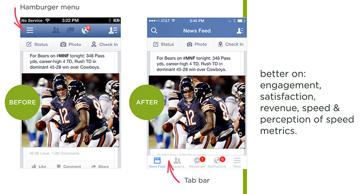 Bottom tab bar - Before and After Facebook analysis by Luke Wroblewski
External consistency is important because your users don’t experience your app, website or other digital property in isolation – it exists within the broader framework of their everyday digital journey.
So while it’s good to think differently, to meet your users expectations you also have to give them a degree of what they are already familiar with.
2. Keep it Clean and Simple
The reason simplicity works is not because end users are dumb – it’s that they’re busy, and don’t much care about the particular tool they’re using.
They just want it to work.
That’s why digital experiences need to be simple – so that users can go back to doing what they want. A perfect example of this is the checkout experience on an e-commerce site.
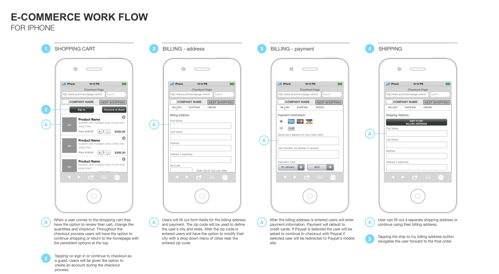
Users are fully capable of making complicated purchasing decisions and navigating complicated purchase flows – if they weren’t, no one would ever buy a house!
The question is whether or not they’re willing to tolerate that complexity when they’re trying to buy a t-shirt.
Odds are, probably not.
So for mobile experiences in particular, they need to be simple and clean.
3. Keep the User Informed
Confused users are unhappy users. Four things that users should know at each stage of the customer journey are:
- What they just did
- What they need to do now
- What’s going to happen when they do something
- What’s going to happen after that
This applies to both broad understanding (like knowing what stage of a checkout you’re in), to feedback for each activity (like haptic feedback when you tap something in an app).
The point is that users should know what they’re doing and why, at every stage of the journey.
4. Start Small
Start with the smallest screen you expect your users to engage with you on. You can scale up, but it’s a lot harder to scale down, and starting small will also force you think about what’s most relevant to the user.
The process of starting small will also help you create a better information architecture, and a better user experience at the end of it.
5. Consider the Mobile Mindset

Lastly, consider the mobile mindset. Think about what people are doing when they’re using your mobile website or app.
Are they on the move? Are they in transit? Are they trying to solve an immediate problem?
These are the sorts of questions that you want to be thinking about as you begin to really develop your mobile experience.
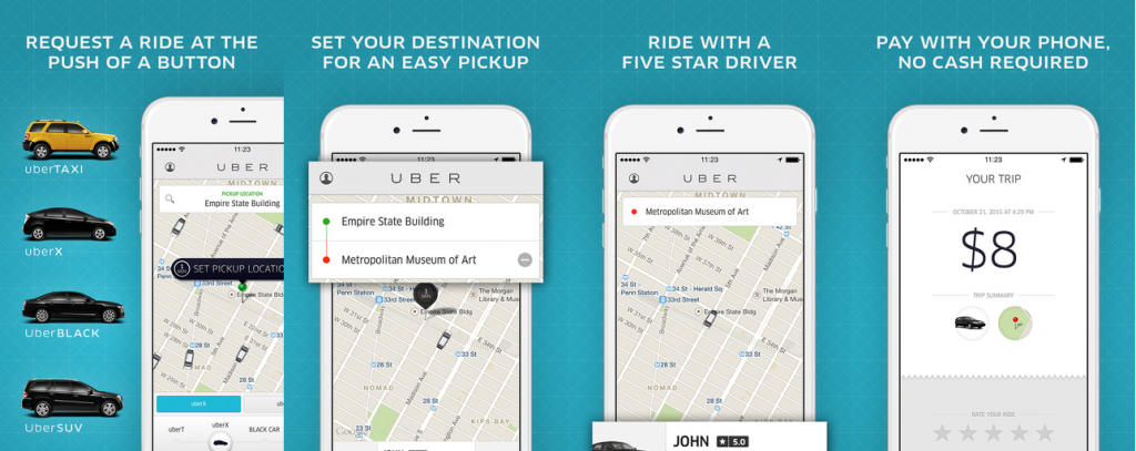
One great example is Uber. Uber’s app lets you find a ride and order it within three taps. The reason this is so efficient is that when people are looking at Uber, they’re most often looking to get a ride, and get it now.
This is the tremendous value to consumers that apps and other mobile-specific experiences can provide: they can offer just what the user wants as the user moves through their daily life.
Understanding your different user segments based on their use case is the crux to the mobile mindset, and absolutely essential to embracing mobility.
Mobile vs Mobility
Those are our top five principles that designers and developers should be following when they’re building out a mobile experience (for a much deeper dive into mobile best practices we recommend Google’s 25 mobile design principles).
But to stay on top of your mobile game, you’re going to need to take it one step further, and extend the concept of the mobile mindset even further to total mobility.
Mobility is about providing the best possible mobile experience at the time that the user is actually going to be engaging with your company.
For example, you could tailor the messaging in an app’s launch screen to cater to people on the go, rather than using the same text block that’s featured on the homepage of the company website. That’s the direction that companies need to shift to in order to continue providing top-end experience that users are coming to expect as the norm.
Looking forward, we see an increased focus on segmenting audiences by behaviour and activity, not on user demographics.
For example, a company might send out different SMS messages to customers depending on what they’re doing at the time rather than what age group they fall into.
As more finessed segmentation tools come into use, we predict we’ll see a comparable shift in how companies create and deploy digital tools, like responsive websites, mobile websites, and apps.
Conclusion
Staying ahead of the mobile curve involves two main factors: first, abiding to tried and true mobile design principles in order to continue to create amazing experiences that succeed in delighting users and making their their lives easier.
And second, building a strategy that considers not only how the user experiences your digital properties, but what they’re doing when they do, and tailoring your experiences to match those transient needs, wants, and desires.
In the future, segmentation by activity will become more prominent in how companies talk to their customers, and we expect to see significant spillover into how companies approach digital tools.
Companies that are going to win in mobile are companies that embrace established design principles while focusing on what users need, when they need it, and providing that solution in an elegant and intuitive package.
