For years, we’ve been hearing predictions about the end of flat design, debates about whether flat design is a revolution with staying power or a passing trend, and arguments for embracing a post-flat world.
But flat design is so ubiquitous that it’s been hard to imagine the next-best-thing that might supplant flat design. Until now, that is.
There are signs that flat design might be on its way out. Google’s material design is bringing some skeuomorphism back into our lives, and Apple’s recently revamped design language for iOS 10 has softened the company’s hard-line on flat design.
The question is, do these trends really mean that we’re moving away from flat design? And if we are, what does that mean for the rest of the web and app universe?
Flat Design Recap
Before we jump into the shake-ups coming to flat design, let’s recap what it really is. We’ve covered flat design on the blog before, so we’ll keep this simple.
When flat design arrived on the scene, it marked a major departure from the previous era of skeuomorphic design. While skeuomorphism focused on using shadows and textures to make items resemble their real-world counterparts, flat design rejected all that.
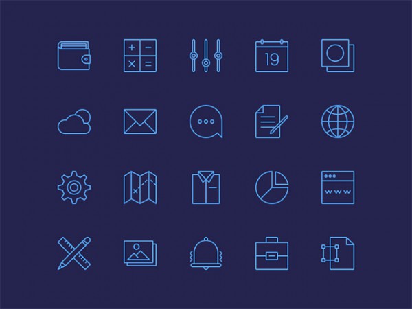
Flat design removed the drop shadows, gradients and textures used in skeuomorphism and replaced them with a more minimalist look: think flat colors, thin lines, simple typography, grid organization, and visual clarity. No more leather or wood-grained backgrounds or bubbly icons – just simple lines and clear graphics.
There’s no denying that flat design is the star of the design world. But it has its skeptics, and we all know that design trends ebb and flow. In a poll done by the Usibilla blog that asked users whether flat design was a trend or a revolution, the conclusion was clear: most people saw flat design as a fleeting fad.
So what comes after flat design?
Material Design
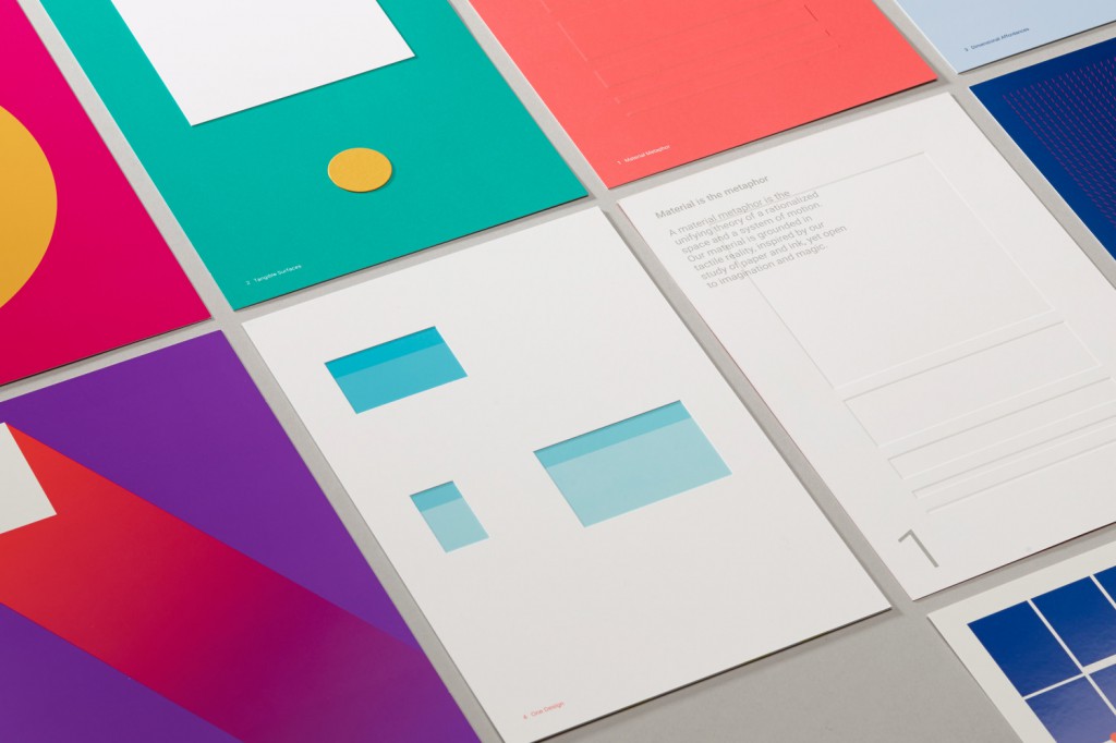
The likely successor to flat design is material design – an approach that’s been popularized by Google. Material design doesn’t move far from the central principles of flat design, but it gives users a totally different feel.
Simply put, material design brings some elements of good-old skeuomorphism back into flat design. It hangs onto the sleek minimalism of flat design, but adds a little more depth and texture (through the use of light and shadows) to its representations of real-world objects and interactions. Buttons look clickable again, its easier to perceive information hierarchies, and designers can play around more with light and shadows.
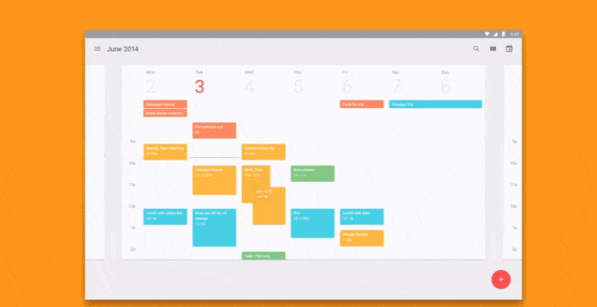
When Google introduced Android Lollipop in late 2014, we got our first look at what material design would look like – and it was good. Lollipop kept the clean, modern aesthetic of flat design but it incorporated more light and shadow to bring a depth and ‘delight-factor’ back to its designs.
Material design was met with a lot of fanfare from developers and designers – it’s intuitive and device-friendly, and it improves the user experience in terms of both accessibility and delight. It also shook up the stale and, well, flat experience that had started to sink in as flat design became ubiquitous.
Lollipop also raised the question of whether Apple would respond with a design innovation of its own. It seemed unlikely, until this year’s WWDC where we saw Apple introduce some big changes to iOS’s design language.
iOS 10 Design Language
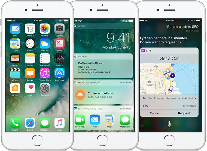 via Apple
Since iOS 7, when Apple dropped its wood and leather backgrounds and skeuomorphic icons in favor of flat backgrounds and minimalist icons and fonts, the company has made its commitment to flat design clear.
But with iOS 10, Apple is melding its stark, minimalist flat design with something new. Leading with the tagline ‘Big. Bold. Beautiful.’ Apple introduced some major changes to its design language, including heavier and bigger fonts, sleek white backgrounds, bold headers, and stronger use of images.
The overhauled Music, News, Health, Home, and Map apps are all examples of Apple’s new style at play. They’ve ditched hyper-thin fonts and translucent backgrounds and replaced them with stark white backgrounds with big, bold headings and smaller sub-headings. Images, such as album art, are also much bolder in the new iterations of these apps.
So, does the bolder, simpler new look mean that Apple is transitioning away from flat design and towards something closer to Google’s material design? Not necessarily.
The redesign does give Apple more room for adding depth and texture to the user experience (as well as better cues and more comfort, thanks to bigger, bolder touch targets), but it’s achieving this without reverting to its old skeuomorphism.
Apple’s design changes are probably more indicative of the fact that Apple seems to be softening its approach to flat design, taking user feedback about font size and readability into consideration, and bringing back some of the wow-factor that it lost in the switch to flat design.
What does this mean?
Google and Apple are both showing some signs of moving away from hard-core flat design. But neither one is rejecting flat design completely – and they probably shouldn’t. We don’t need to go back to skeuomorphism (and we don’t want to go back), but incorporating more rich design features into the minimalistic strengths of flat design seems to be the way forward – not only for Apple and Google, but for the entire web and app universe.
This Collective Ray blog post on ‘post-flat’ design probably puts it best: flat design was great for giving designers a clean slate, but it also took away a sense of creativity, wonder and whimsy. That’s why they want designers to ‘dust off your drop shadows and gradients, and introduce them to your flat color buttons and icons. Do your absolute best work without feeling restricted to a single aesthetic. Bring variety, creativity, and delight back to your interfaces.’
So what’s the takeaway? Flat design might not be dying, but it’s about to get a lot more fun. Google and Apple have already started breaking the flat design rules – it’s only a matter of time before everyone gets on board.
