When iOS 7 was announced in early June, many gawked at the new 'flat' icons, lack of skeuomorphism, and bright colours, while others were excited about a change in design that would make their iPhone or iPad feel like a new device.
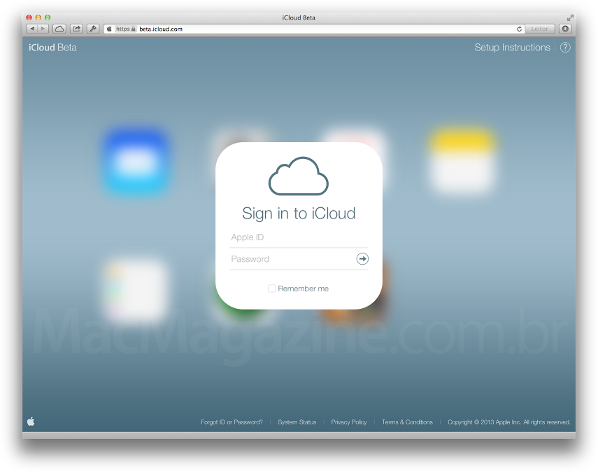
But this week we learned that the iOS 7 design aesthetic isn't ending on Apple's devices – it's already being rolled out to iCloud beta, the online services Apple provides to its subscribers. The online versions of Mail, Reminders, Calendar, Notes and more have adopted the same translucent layers and flat icon design as their mobile counterparts.
 It's no secret that Apple's design direction has far reaching impacts – not only on app developers and hardware manufacturers, but also on web designers. Given that, it's not a far stretch to imagine that when iOS 7 is officially released to the public this fall (predicted to be September 10), a lot of the polarizing design aesthetics that makes the new software so unique will have style impacts on websites.
Here are 3 elements of iOS 7 we think will make it on to the web:
It's no secret that Apple's design direction has far reaching impacts – not only on app developers and hardware manufacturers, but also on web designers. Given that, it's not a far stretch to imagine that when iOS 7 is officially released to the public this fall (predicted to be September 10), a lot of the polarizing design aesthetics that makes the new software so unique will have style impacts on websites.
Here are 3 elements of iOS 7 we think will make it on to the web:
1. Flat Iconography
The rounded shapes with a glare reflecting off of them are on their way out. Instead, simpler and "flatter" icons will take their place. In the
iOS 7 design guide, this is how Apple describes how icons should look:
- In iOS 7, bar button icons are lighter in weight and have a different style.
- Prepare for borderless buttons by moving away from supplying button background images and by reassessing your layout.
Check out the new icons iOS 7 Mail and you'll be able to see the flat, borderless icons:

2. Translucent Layers
Seen in the below image on iOS 7's new Control Center feature, the 'frosted glass' translucency is one of the most impactful new design features of the software.
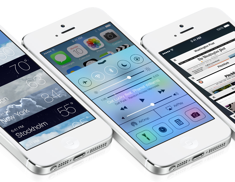
And while web design of the past is no stranger to translucency, we expect it to become far more prevalent, and far more drastic. A standard gray lightbox may soon be entirely replaced with a frosted glass layer, or drop-down navigations could adopt a more translucent background to allow a site visitor to maintain their orientation when navigating a site.
3. More parallax - but in a different way
Typically, we think of a parallax effect on a website to be when a user is scrolling down and sees different layers shift and float over each other. The true definition of parallax is:
The effect whereby the position or direction of an object appears to differ when viewed from different positions.
This is by far the most striking design feature of iOS 7, and can be seen in the video below:
With that in mind, check out Air Jordan’s website at
jordan.com. When you move your mouse around the screen, you get the sense that the shoe in the background is moving based on its position.
We expect that this type of parallax will become popular in web design after the release of iOS 7.
Are there any other features of iOS 7 that you think will be influential in upcoming web design?
