What is responsive design?
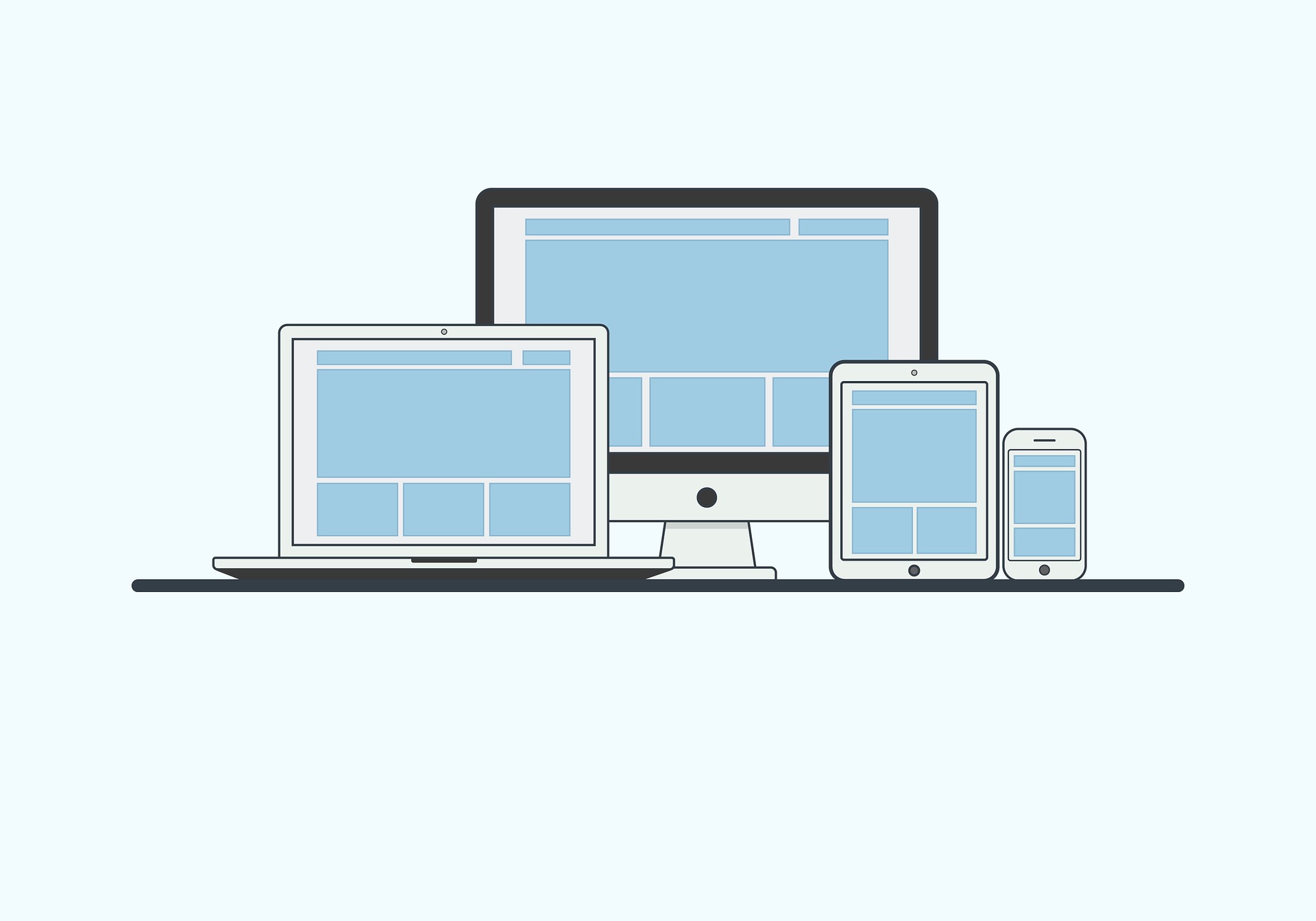
Responsive web design is a form of mobile website design where site elements are fluid across any screen size or aspect ratio.
The site’s design degrades consistently between all screen sizes, from desktop to tablet to smartphone. Website elements reposition themselves in a predetermined structure, but one that always fits precisely to the screen resolution it’s being viewed on.
Responsive design has been around for a relatively long time now, and often seems like the single answer to mobile optimization because of the sheer number of mobile devices around – and it certainly has some advantages:
- Responsive design quickly and cost-effectively provides a fairly robust experience across all devices
- It allows companies to manage multiple front-ends from a single backend, displaying all their content across all devices without any hitches or additional work
- It lends itself to templating, as we’ve seen in the enormous success of RWD templates on CMS platforms like WordPress
And since it started back in 2001, it has kept up and continued to work relatively effectively.
Many people also refer to ‘adaptive design’ as responsive, but adaptive differs in that it uses multiple breakpoints (e.g. one for tablet, one for smartphone).
As an example, a site could be set to adapt to dimensions of a standard desktop monitor, an iPad in portrait view, an iPad in landscape view, and an iPhone. If you access a website from a device that falls between the specs of one of the above listed devices, you’re served up the next closest experience.
In some cases, this could result in a sub-par experience for the mobile user (e.g. someone on a phablet viewing a smartphone interface).
How responsive design works
Media queries are expanded in HTML5 and consist of support for checking various media features, like “width”, “height” and “colour”. By leveraging media queries, the presentation of the content can be tailored to the device without changing the content itself.
Using responsive design, a phablet user would see an interface somewhere between a tablet and a smartphone – as we think they should (and they would likely agree).
Limitations of responsive design
As we rush at an ever-increasing pace towards a mobile-first and mobile-only world, users are putting new pressures on businesses to deliver unparalleled customer experiences – or else they walk.
And as the demand for quality continues to grow, techniques and trends are becoming dated faster and faster.
It’s increasingly evident that the limitations of responsive design mean that today and for the future, it very well might not be enough for a rich mobile user experience.

Personalization
Responsive design serves the same content to everyone
The biggest problem with responsive design springs from its biggest strength – it serves everyone the same content (for the most part).
If your goal is to provide the same shopping experience on a phone and a laptop, this is great. But the problem is that many sites can actually split user needs by device.
Banks, for example, probably have different user groups based on device. Primary tasks for mobile users include checking their balance and transferring money, while laptop users want information about investment and savings plans.
With other mobile solutions like apps and mobile websites, you can customize your content and site design based on what people are probably going to want to do on the site.
With responsive design as it currently stands, it’s possible but requires serious investment.
Customization and Speed
Responsive design won’t optimize for mobile speeds
With the content is always the same, your site weight is static, regardless of what network your user is on. There’s no ‘site-lite’ option for responsive websites.
What this means is that if your users are browsing on mobile networks that are historically significantly slower (although this gap is closing) then they’re going to have to load oodles of stuff – images, fonts, rich interactions, for example – effectively slowing down the user experience.
And with speed an increasingly important ranking factor for Google AND important for your bottom line, that extra wait time can cost you some serious money.

Differentiation
Responsive design can’t compete with the experience offered by apps
This is really what the problem comes down to. The prominence of apps in the mobile world has reached a point where other online solutions like responsive design simply don’t compare.
And as app development costs continue to drop, they are increasingly the first choice for mobile experience.
The ability to work offline, use push notifications, leverage in-app advertising, and provide a better, more stable mobile experience all means that mobile apps offer a tantalizing option compared to mobile responsive sites.
User Experience
An article published over at Smashing Magazine, titled You May Be Losing Users If Responsive Web Design Is Your Only Mobile Strategy, makes some great points that everyone should consider when making plans for mobile compatibility.
One of the most interesting facts in the article from Smashing is that the guy who originally coined the term “responsive web design” also said:
“Most importantly, responsive web design isn’t intended to serve as a replacement for mobile web sites.” — Ethan Marcotte
Despite this quote, a large number of developers and designers are treating RWD as the silver bullet solution that gives clients a mobile site, tablet site, and desktop site. But in a lot of cases, this one-size-fits-all approach is accomplished at the expense of the user experience (UX).
Poorly executed responsive design really just crams a desktop site’s features and functionality into a smaller screen, without thinking about how the end user is really going to use the site, or ensuring that is user-friendly to navigate.
Deciding on responsive design for the wrong reasons
The article on Smashing wraps up by pointing out that too many clients/designers/developers see responsive design as the goal, rather than a method to achieve the real goal (which should be to provide a great mobile experience for users).
When you set responsive design as a goal, it becomes easy to lose perspective. What is the real problem you are trying to solve? Is being responsive really a problem? Probably not. But do you understand “being responsive” to mean “being mobile-compatible”? If so, then you might be making some mistakes.
The ultimate goal for a website should be “happy users,” which will lead to more conversions, whatever a conversion might be, whether it’s getting a visitor to spread the word, providing information or making a sale. Users won’t be happy without a high-performing website.
This is something good to keep in mind before listing ’responsive design’ as a requirement for your project.
How to save your responsive site
Fortunately, it’s not all bad. For starters, despite the problems above, responsive design (in conjunction with a robust CMS) remains a quick and effective way to get your website online and in front of users who you need to be in front of.
A bad responsive mobile site is better than no mobile site.
Second, for some sites, the problems mentioned above, like displaying the same content or optimizing for mobile speeds, isn’t so important.
For example, if you’re a clothing ecommerce website, you need to load high res pictures of your products regardless. While you want to optimize as quick as you can, it’s not like cutting out images is really an option for you.
Finally, apps. Yes, apps are an aggressive usurper of the RWD reign. But apps actually suffer a similar problem to RWD – they generally present the same content to everyone.
As responsive design begins to leverage metadata information more, it can get to a place where it’s showing a specific design and specific content to a specific audience. For example, if kids are using a site, it’ll be designed in bright, fun colours.
Responsive design is uniquely positioned to take advantage of that sort of development – and it just might prove its saving grace.
5 Questions to ask before choosing responsive design
Responsive is great for when it’s appropriate, but there are a few caveats to this.
Here are 5 basic questions to ask yourself before committing to a responsive design:
1. Does your content provide a good UX on a smaller screen?
Many designers and developers simply take their website’s desktop version and decide to compress it with media queries (media queries are special “commands” that can be issued via a style-sheet to get your website to look certain ways when the window hits certain sizes/dimensions), but keep the same basic content layout/arrangement for several different viewports.
This can make for a very uncomfortable user experience without content structure repositioning.
Responsive design is great because it allows you to make changes to your markup and CSS when a site is viewed at certain screen dimensions. Take advantage of this by making sure your site’s content looks presentable on a number of common device’s screen sizes.
Don’t just shrink the content, move it around by creating custom markup for each device.
Turn a long, horizontal nav into a touch-activated dropdown menu. Turn content side-by-side into content stacked vertically on top of one another.
Responsive design isn’t just ensuring content fits the screen, but that it fits it well.
Be creative and always remember the UX comes first, which is why responsive exists in the first place.
2. Does your site rely on display advertising?
This is a natural extension of the first question on this list. Responsive websites shrink or reposition content depending on the screen size.
Display advertising is a common way for websites to generate revenue. Most leading ad platforms have created responsive ad sizes, but placement is still important.
Views and clicks on those ads are crucial in this case, and a responsive layout that isn't well thought out may bury ad content that was once on top of your sidebar all the way at the bottom of a page.
Think about where your users are going to look when accessing your website from different size devices. Where will their eyes focus? What parts of the website will they most be likely to navigate to?
These are all questions to take into account when creating your responsive layout, and the answers will differ per each device size.
3. Will your mobile/responsive design defeat user expectation?
Again, this is a question to ask after the first question on this list. The bottom line of designing a website is to appease the end user who has to use the site.
Although users are increasingly becoming more accustomed to designs changing with the devices they use, some websites might make sense to keep the overall layout the way it is to curtail to user expectations and comfort.
Your webpages may look good on a smaller screen, but it still has to function well, and if users can’t find where certain features are, a pretty aesthetic won’t keep them from leaving the page.
A blog is a good example of this. Most blogs have a look and layout that’s expected: header, content, sidebar. Where do you move that sidebar? Will it reposition to the very bottom of the screen? Will it become a slide-out menu? These are things one has to consider.
Always design with the user in mind.
4. Is your design developed for digits?
There’s no mouse or trackpad for mobile or tablets.
Do you have links on your website? Well, fingers are typically bigger than mouse cursors. That makes the links pretty easy to miss.
Are there dropdown menus that activate when hovered on? Well, typically we don’t keep our fingers on one place on our touch screens very long for fear of smudging or damage, and touch screen interfaces don’t accommodate hover states.
Nothing’s worse than trying to get something to function and it not working, and site functionality is all about clicks.
Ask yourself these questions before settling on a responsive design template. It goes further than just the visuals. Responsive is also about the functions and interface itself adjusting.
5. Is it really needed?
Responsive design means an added request to the server with a browser having to choose from multiple “looks” depending on the viewport dimensions. Designers might hide elements, but the browser still loads them on the back-end, and loading time will relatively suffer.
In many ways, responsive design is a tradeoff or compromise.
Will the user really benefit from it? Is the site minimalist and uncluttered enough to be functional on a smaller device anyway? Or is a discrete mobile experience the best choice for the site?
The answers to these questions should dictate whether responsive design is really needed for your project/website.
Responsive design is a powerful and functional tool when it makes sense, but remember: don’t rush into adding an extra layer of complexity to a website that doesn’t need it just because everybody else is doing it. Apply the methodology when it makes sense to apply it.
Alternatives to responsive design
If responsive design isn't the way to go for you, what's the answer so you can create the best experience for mobile users?
There are two main routes that businesses can take.
Discrete mobile sites
Mobile websites are one of the first examples of mobile web design, and they remain exceptionally good at their job (especially when it comes to mobility).
Mobile sites can tailor their content to mobile users. This allows site creators to lead with messages and functionality that are suited for people on the go, or just simply working on a smaller screen.
Mobile sites can run faster on mobile phones. Content and rich media can be optimized much more ruthlessly than standard websites. As a result, they tend to be lighter, faster, and more efficient.
And mobile sites generally improve the user experience. All of these factors combine to mean that a mobile site will generally improve the user experience for mobile users.
Mobile apps
But there's another option to help mobile device users get easy access to your content. That's by creating a mobile app for content delivery.
Mobile apps are a good idea if you have a lot of mobile users and can even generate business revenue. For many businesses, the best bet is a hybrid mobile app that allows you to use a common core for content delivery within a native app overlay that works with the different mobile operating systems.
Finally, don't think that you have to choose one or the other. Many businesses have a mobile first web design and an app to cater for all their customers. You could do the same.
Final thoughts
Responsive design is like an incumbent leader – yes, there are some scrappy upstarts nipping at its heels, and yes there are naysayers out there predicting its timely demise. But we think that the future of responsive design continues to look bright.
While responsive design might lose some market share, there will always be an audience that wants a site that displays across all devices quickly and cost-effectively, and there will always be those who are looking to push the envelope on how personal you can get.
Responsive design might change, but we think it’s got more time ahead of it.
