One of the core tenants of good typographical designs is selectivity.
Keep it clean, pick two or three fonts that gel nicely, and move on.
But no more!
Since roughly 2013, there’s been an interesting typographical trend working away in the background of digital design, with curvaceous script fonts, hand written fonts, Egyptian, and sans serif all mixing together to form beautiful mixed typography.
In this article we look at where this mixing trend came from, and a few guidelines on how to use it yourself.
Where it came from
Like most trends, it’s impossible to say ‘yes, this came from
right here’ but recent typographical trends appear to have emerged – at least in part – out of hipster culture and the web marketing focus on content.
Hipster culture: Vintage + Artisanal
Hipster culture has an enthusiasm (
according to Wikipedia) for artisan products and vintage clothing, among other things like indie music.
But we think that the trend emerged out of those former two more than anything else.

Photo via flickr
If you look back at old medicine bottles from the late 1800s in the US (the heyday of absurd medical remedies, including Coca-Cola) there’s a lot of mixed typography.
So much so in fact that old labels, far from looking dated, actually look more current than websites, signs, and packaging from only three or four years ago.
Fast forward to today, and mixed typography became a way to instill a vintage, aged feel to new products, particularly new artisan products.
These appear to be ground zero for mixed typography.
First, because their core demographic has a passion for artisan products, and second because a lot of artesian products are about taking something back to how it used to be done.
Take Brooklyn Bouillon, for example.
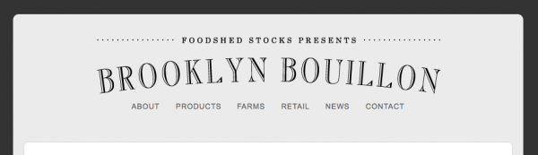 They’re a small company who make artisan bouillon, or stock. They pride themselves on making their stock like you used to make it at home, and they use mixed typography to reinforce that idea that old is better, and they’re old.
Another example is Brooklyn Soap.

They’re a soap company built on the idea of using organic products to make “home-style” soap. Again, the idea that older techniques are better is reinforced with their mixed typography.
Content first
Content is king could be the marketing mantra for 2014, and it doesn’t look like it’s changing.
And if the message is the most important thing, then it makes sense that the more important graphic will be typography.
It means that attention is always focused on content, but is still interesting to look at. Win-win for the content-minded marketer.
How to mix typography
The danger of mixed typography is that it can go very wrong, very quickly.
While it’s great for web design to be so focused on typography (because if you’re focused on fonts you’re probably focused on content) it can spiral out of control pretty fast.
The goal is to unify your typographical decisions with some shared context.
While it might look great by mixing 37 different fonts for one sign, the result can be confusing. By unifying your fonts with some shared context, it’ll help people perceive and understand the content, which is the whole point anyways.
Context might be a shared historical design, for example picking fonts predominantly from the 1800s (like the above examples). Or it might be picking fonts that fit a particular product – for example, choosing a few fonts that are used on artisanal products already.
If you can help your reader with subtle context clues, then there’s less onus on the font itself to carry comprehension.
Conclusion
Mixed typography started in the world of hipsters, but has since merged with the mainstream and is being applied to more than just artisan organic products.
We predict that it’s here to stay, at least for a little while, as an edgy way for brands to but their message front and centre, and keep it there forever.
If you want to mix and match your typography, just remember that the more context you can unite the fonts with, the better. Start with just changing the weights of one font, and then start exploring more creative options.
