We see user-experience (UX) as an essential part of your digital strategy and crucial to having an effective digital experience.
UX is not just about design, but includes all of the factors that influence a visitor's engagement with your digital property.
Usability is fundamental to any UX, and we look at five best practices to help you give your users the best possible mobile experience.
1. Speed is King
When designing mobile experiences, speed isn't usually thought about until development; traditionally designers come up with the ideas while the dev team is responsible for bringing them to life.
However, when it comes to the usability of a mobile website or app, speed is not just a nice-to-have. It is absolutely essential.
Why?
Because more than ever, speed is a key expectation for mobile experiences.
For mobile websites, There is a clear relationship between load time and page abandonment, which shows that the quality of the user experience (and a user's willingness to engage) on a mobile site is heavily influenced by the time it takes to load.
For every extra second a page takes to load, more and more visitors decide that it is not an experience they are willing to wait for.
Fortunately, there are many things that both designers and developers can do to turn a mobile site into a speed demon:
- Reduce the number of lookups by storing images yourself, reduce the number of plugins and out-of-site links, and simplify font families
- Reduce the amount of rich imagery, and imagery in general
- Cut or heavily reduce ads and ad formats. For example, it’s better to have static banner ads rather animated ones produced in HTML5.
- Make page-speed a consideration in the design process. Work with your developers to understand what objects and features limit a site's speed during the design process.
2. Simple Navigation
There is an old myth that everything in your digital experience has to be three clicks or fewer away for the best engagement.
This has been pretty robustly debunked – rather than designing for a number of clicks, navigation should be designed for simplicity, as Joshua Porter wrote in his 2003 article “Testing the Three-Click Rule”, “
The number of clicks isn’t what is important to users, but whether or not they’re successful at finding what they’re seeking.”
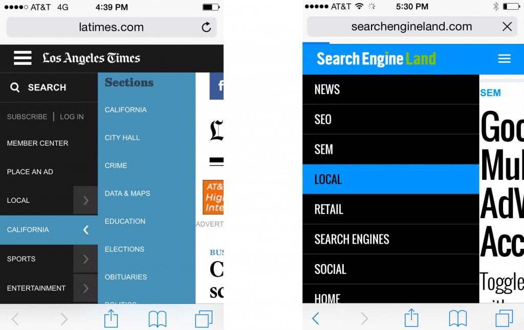
The reason that mobile user experiences benefit from streamlined navigation is because the best mobile apps and sites aim to do fewer things better. E
Everything from the content they feature to the very bones of the Information Architecture (IA) should be lightweight and essential. No fluff.
Mobile experiences that have a small IA tend to be better overall, since the very act of limiting the containers for content tends to focus the content itself and ensuring that users are successful at finding what they are seeking.
3. Capitalize on Mobile Features
Smartphones are powerful devices. They’re simultaneously web browsers, pedometers, GPS, flashlights, cameras, boom boxes, and of course also a telephone.
Mobile sites should leverage the available functionality to improve usability.
Mobile phones can respond to all sorts of specific movements, like shaking a phone might turn on a flashlight. So far these sorts of kinetic interactions can only be used by apps and in-phone functions, but there is also an opportunity to lever them for the mobile web.
Some features mobile sites already take advantage of are click-to-call and GPS/map integration, but there’s other potential with multi-touch features, too.
Allowing users to swipe to navigate – for example, between articles or through a slideshow gallery – can provide a much better user experience than a traditional tap or click on mobile.

Of course, this speaks to a larger point: when you build a mobile website, take what you know about how your user is going use it and step outside the box to consider how you might be able to lever the other features these devices have to improve your UX .
When you have the opportunity to connect generic device functionality to unique site functionality, it will not only distinguish yourself from the competition, but also reinforce a positive user experience.
4. Make it Shareable
This is one of the most commonly ignored aspects of mobile usability – how easy it is to share and promote mobile content across other digital channels.
If encouraging users to share content is a key part of your strategy, consider using a mobile website rather than a dedicated app.
Apps, for the most part, have to be downloaded from the App/Play Stores, and installed on a user’s device before they can access the content (unless there is a corresponding web experience).
Mobile websites, on the other hand, are on the internet, and in most cases their content can always be visited using publicly accessible URLs.

SEO, PPC, social media advertising, shareable links, off-site SEO, and email marketing are all ways that you can drive people directly to your mobile site – no app install necessary.
With mobile sites, you have ample opportunity to promote your product, so make sure your site’s content is shareable. It will have a positive impact on your site’s usability.
5. K.I.S.S.
Our top tip for keeping things usable (and one we constantly remind ourselves) is K.I.S.S – Keep It Simple, Stupid.
It’s a mobile experience, not a space shuttle. It’s easy for a simple idea to be completely enveloped by a project, and distorted into a different creature where usability is an afterthought.
Adding too much content, losing focus of your end-user, compromising your architecture, building in too many ads, modal windows and other rich media – pretty soon, your user experience is sending users away.
So keep it simple. Focused. Minimalist. Refined.
Mobile sites are simple. And there is beauty in simplicity.
Summary
Mobile continues to be the easiest way for companies to create the tailored user experience that customers demand. And with these fundamental UX principles, you can’t go wrong.
