The food and beverage industry has always been about the full package.
When you dine out at a restaurant, you’re paying the fee not just for the food, but for the entire experience – from décor, to service, to atmosphere.
Similarly, branding and product-packaging is key when choosing which one of the three hundred similar food products you’re going to buy at the grocery store. It’s ironic then that food and beverage websites often solely focus on content, and spoil the full package: the site’s aesthetics, usability and user experience.
From too much content, to auto-playing sound, we go over some of the food and beverage industry’s most common lapses in judgment when it comes to websites, and briefly give some pointers on what to strive for, like saying more with less, clean design and easy navigation, as well as smart image use.
What to Avoid
Unnecessary Auto-Play
A leftover from the earlier, not-so-wise days of the internet, for some reason food and drink websites will frequently still use either automatically playing video, animations or music.
These are all good, if triggered by the user, which means they want to see it.
Otherwise, it’s only good for a high bounce rate.
Unfocused Design
Bright colors and detailed patterns distract from the content and can even hurt a user’s eyes. Additionally, elements of the website that constantly move without being triggered by the user can be seen as annoying.
Ideally, you want to get at the crux of what your particular brand of food or drink represents, and strip away all of the unnecessary detail.
Campo Viejo’s website, pictured below, uses very bright colours, and its homepage features a rotating carousel, but without obvious controls to allow users to skip or stop the banners.
Another bad practice is represented on the main homepage banner, with a call to action that takes users away from the site (to Facebook) before they’ve had the chance to explore what Camp Viejo’s site has to offer.
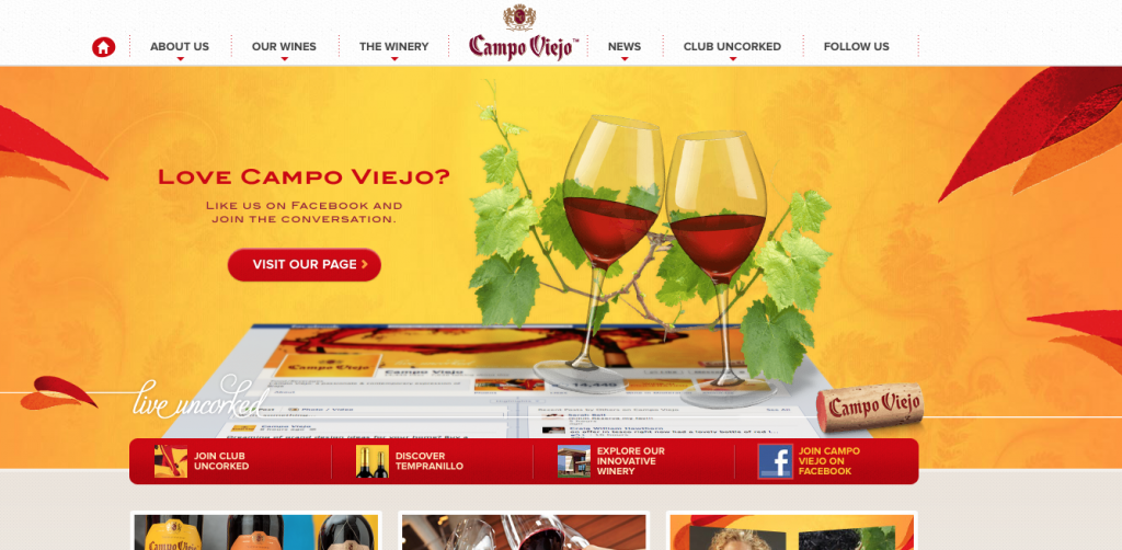
However, what the homepage lacks is made up for with an excellent implementation of a mega menu in the footer, as well as well designed pages to showcase each of the varieties of wines.
All the bells and whistles in the world cannot help you if your design is ambiguous, unclear or confusing.
Consider this second example, the website for Becherovka.
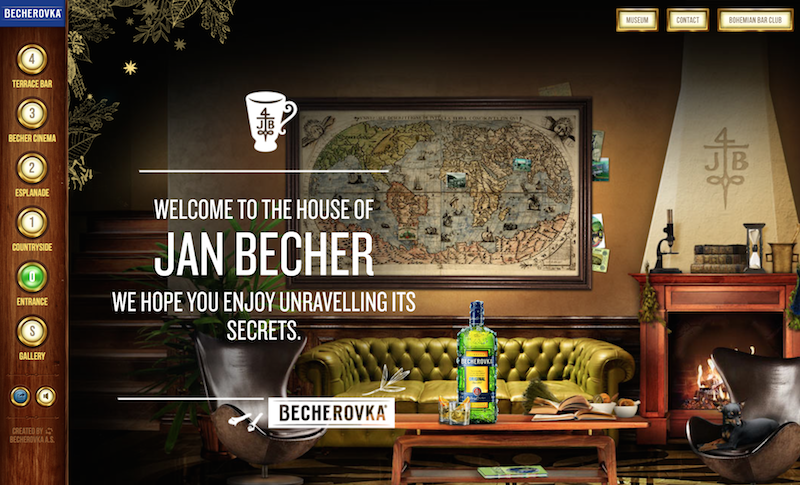
The site is designed more as a video game experience than as a showcase for the brand and its products.
The navigation is confusing, with labels that don’t indicate what content can be found in each section. To find out what information resides on the site, you have to click, scroll and drag your way through different “areas”.
The site is confusing enough, in fact, that pop-ups consistently appear to instruct users how to move around the site, which itself shows how unintuitive it is.
But what the desktop site lacks is made up for with a mobile experience that is much easier to navigate.
Expired Web Elements
The first impression potential customers get from your website is very important, and you don’t want it to leave a bad taste in their mouths.
A website that looks ten years old is bad. If your website runs on Flash, uses a dated font, or uses frames, it’s a pretty good indication that you need to do some retooling.
The last thing your user wants is to be treated to ugly overlays or frame loading screens.
G.H. Mumm is an example of a site with excessive “Loading” screens, and text that’s buried in on-screen frames.
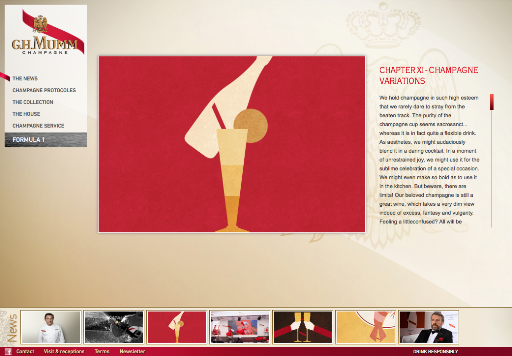
Though, to its benefit, this site was designed to accommodate a wide range of screen sizes, with responsive elements that ensure images and content are positioned optimally whether viewed on a large screen or small.
Unappetizing Colors and Textures
Color choice is especially important for food and drink websites.
Warm colors create an enticing and friendly attitude, but a color palette that’s “too hot” might be overwhelming. Green and blue create a fresh look, but a green that’s too intense might ruin an appetite.
Many food and drink websites, for one reason or another, are still stuck on skeuomorphism. That is, they have navigation menus that appear to be on wooden boards, have textured backgrounds, and simulate real world sensibilities in their design.
This isn’t very appealing and can even increase page load times. It also looks very dated in this age of flat, minimalist design.
Big House Wines is a prime example of this.
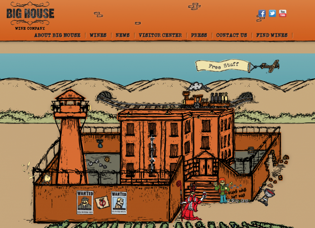
The Big House website does, however, make good use of navigation. With persistent header navigation and a mega menu in the footer, users are able to very quickly find what they are looking for on the site.
What to Strive For
Minimalize
Focus on the essentials and remove all of the clutter. Make any big animations, transitions or changes in your website happen when the user wants them to, and not randomly and automatically.
These considerations will help the website load much faster, puts the control in the users’ hands, and distills your food and drink information to something palatable.
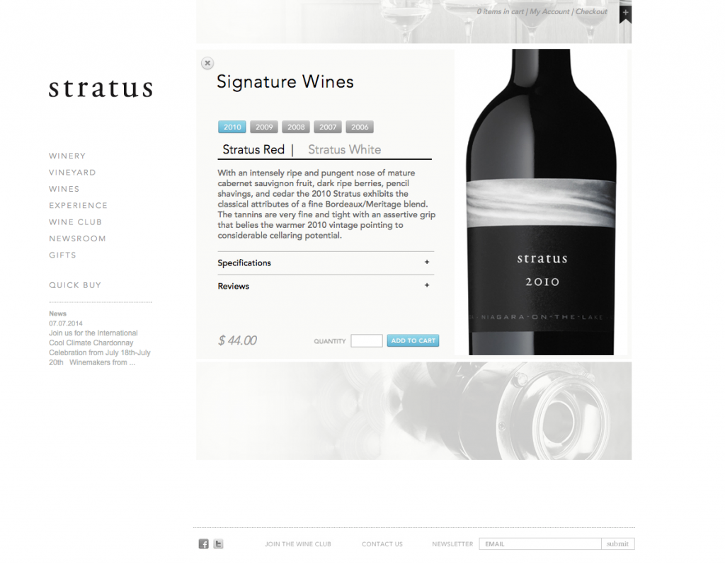
A great example of this is the website for Stratus Wines.
Social Media Integration
Let your customers share how good their food was, how easy their drink went down, and/or how great the restaurant experience was.
User testimonials are great and social network integration provides the platform to do just that.
Great Usability
This is what it all comes down to. A pretty website with lots of bells and whistles falls second to a simple one with
smooth, intuitive usability.
Does the user want to browse through several pages? Is there a more elegant approach? Can the same information be relayed on a single page with scrolling? All of this matters.
Websites for Stoneleigh wines and Cupcake Vineyards are great examples of this, using full-sized images to and easy to digest blurbs to show off their brands with appropriate, minimalist colors to suit their brand and easy, intuitive scrolling.
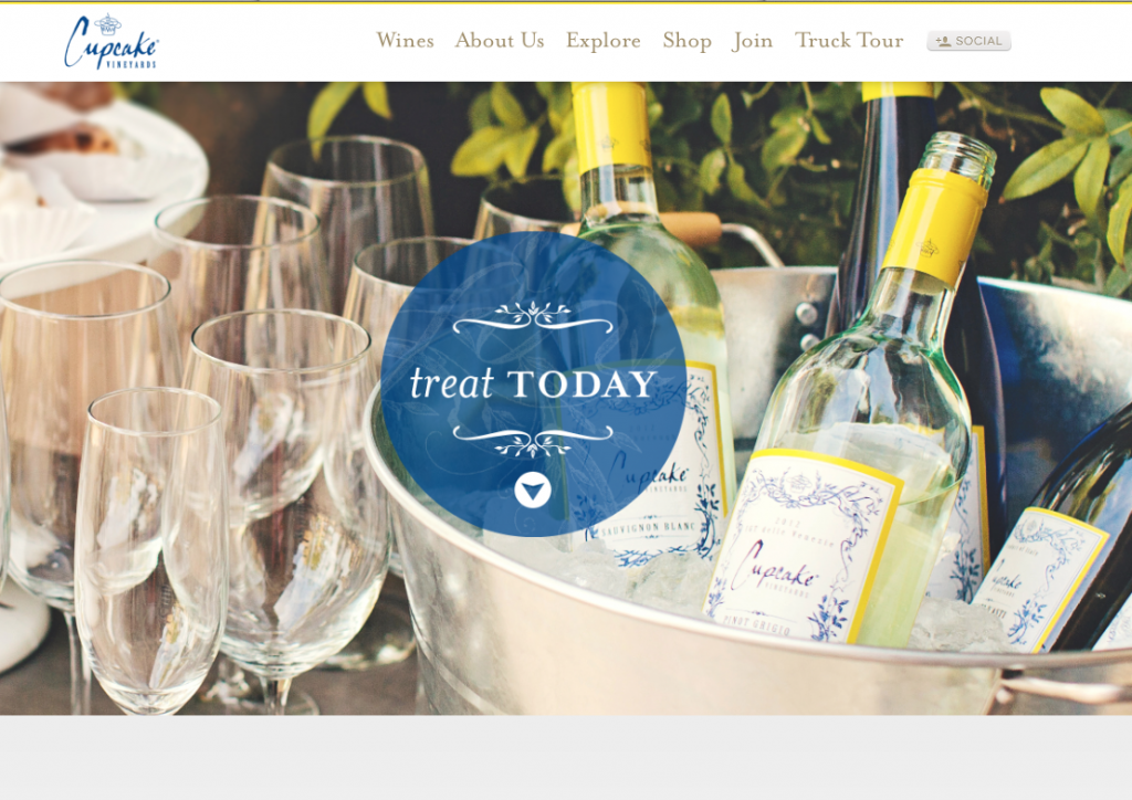
These sites are great examples of how to make a food/beverage brand website effective, without all of the the unnecessary animations, auto-play, or confusing design that makes site content hard to swallow.
