You know when you’re using a website or an app and it just seems to work? When doing what you want it really easy?
An experience that’s actually noteworthy, so much so that you’ll talk about it?
What makes that experience so good?
We think it’s micro UX, and we wanted to tell you why.
This article covers:
- What micro UX is
- Why it’s important for every digital product
- 5 outstanding examples of micro UX that will fill your heart with glee
What is micro UX?
Micro UX is the user experience of one single action within a larger process of user flow. It’s usually used with the term
micro interaction, which is any one action within a larger series of actions by the user.
For example, let’s say you’re using Instagram. Whenever you tap a button during the process of posting a photo, that’s one micro interaction. The larger interaction is the process of posting a picture and might include dozens of micro interactions, including:
- Taking the picture
- Applying filters and editing the image
- Tagging the image
- Writing a comment
- Posting the image
- Commenting on the image once it’s online
But the physical action of tapping a button to post an image is one micro interaction. And the experience around that one tiny interaction? That’s micro UX.
Every interaction or process between a user and a digital product is made up of dozens of micro interactions. However, the nitty gritty details are often neglected, which might not cause a huge problem for that one piece, but over the entire process, adds up to
a poor user experience.
Let’s go back to our Instagram example. That one little micro interaction of tapping button includes a lot of stuff:
- The shape, design, and colour of the button
- What happened to the button when you pushed it
- The feedback you receive that the button is pushed – visual and tactile
- What the button says. Does it say ‘post’? Does it say ‘send’? Does it say ‘fly away little photo, into the ether of the interweb’?
And that’s just one little interaction!
But that one little button is incredibly important for the overall user experience.
So micro UX is designing the best possible interactions for the user on the smallest possible scale. It’s going through your experience process and saying ‘ok, so is it clear what we want the user to do in this on tiny interaction? Is it easy? Does the user understand what they should do and why they should do it?’
It’s UX – but small.
Why micro UX should be your best friend
The obvious reason is that every single improvement you and your team can make to your user experience is going to be valuable.
But more than that, micro interactions are what’s really going to delight your users, and create an experience that’s notably awesome.
It’s all about creating a friction free experience, and usually it’s the little things that are going to drive people crazy.
For example, when was the last time you got really enraged about a poor information architecture on a website?
Probably never.
But when was the last time one button drove you insane? That’s why micro UX is important.
The second reason is that micro UX is a place for some quick, easy wins. Because they’re smaller interactions, they’re usually fast and easy to fix!
With some simple user testing, you can quickly identify micro sticking points and improve on them (especially if you combine user testing with A/B testing).
Micro inspiration
There are literally thousands of
amazing micro UX examples out there, but here are our favourite 5 that for us really sum up what we’re talking about.
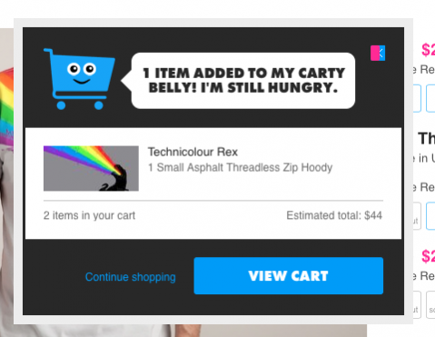
1. Threadless Tee’s shopping cart
via
He’s cheery, he bounces, and he provides essential user feedback. By having a fast and fun popup window when you add something to the cart, Threadless Tees:
- Informs the user that yes, something has been added
- Confirms it’s the right item by showing it and giving all the essential info again
- Asks the shopper what they want to do next
Small, but mighty.
2. Kayak.com’s Filter searches
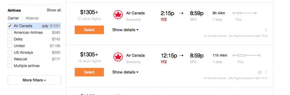
You know when you’re searching for one thing on a website, and you have to un-select all the filters?
That’s super annoying.
Some companies get around it by having an option at the top to deselect all, but that’s still two clicks.
Travel site Kayak.com lets you select ‘only’ for a filter. So say you’re looking at airlines and you only want to see flights for Air Canada. Instead of un-clicking all of the other airlines, you just click ‘only’ next to Air Canada (as pictured above). Done in one click.
3. Chrome’s ‘search google for’ option
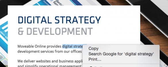
When you highlight something in Google Chrome and right click, it comes up with the option to search for whatever you’ve highlighted. So if you don’t know what a word means, you can just highlight and search!
4. Foursquare’s opening hours
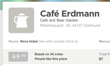
When Foursquare doesn’t have opening hours for a place, they suggest that you have a look when other people are checking in.
5. Pinterest app’s social shares
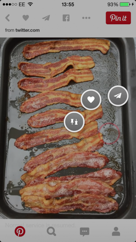
When you hold your finger on a pin, the social share options appear right around your finger, not at the top of the screen. It makes it easier to reach, making your life a little easier.
